Ditch the Pie Chart: 7 Tips for Better Data Visualization
- Datameer, Inc.
- July 10, 2022
Most people love pies, a gooey filling against the brittle texture of the pastry makes a very gratifying combination. Let’s cut to the chase, here’s why you need to ditch the pie chart: 7 Tips for Better Data Visualization
However, pies lose their taste for many when it comes to visualizing data. And for some others, it is totally off the menu. This article will help you understand why.
Understanding data visualization and what makes a good visualization dashboard might also make you ditch the pie charts. And that’s what this article will cover, along with seven tips for better data visualization.
What is Data Visualization?
Data visualization uses graphical representations such as charts, graphs, infographics, and demographics to present information. It aims to visually present bulky data in a summarized, colorful, and easy-to-understand manner.
Data visualization is usually the end product of data analysis. It makes it easier to generate and deliver clear insights from processed data. You can monitor trends over time and make critical decisions to maximize profit or minimize risk or loss.
Data visualization gives meaning and purpose to data. As revolutionary as data gathering is to your business, raw, unprocessed data has little use if it’s not analyzed and presented correctly.
The last few years have seen data go from unavailable and expensive to cheap and easy to access, but it is still a monumental task to analyze it and draw meaningful conclusions.
Good data visualization is a step in the analysis process that makes that task easier.
What Makes a Good Data Visualization
Whether you are using your marketing performance data to create revenue projection reports or monitoring your product adoption rate , the benefits of data are better appreciated when you can easily communicate complex data analysis to stakeholders.
A well-detailed data graph communicates that you have a clear understanding of your data and makes it easy for your audience to take simple, real-time action from your dashboards.
Datasets can be visualized in many ways, including graphs, charts, tables, and geospatial mapping.
Before you choose some of these methods, you should ask yourself: “what’s the purpose of my report?” Are you simply reporting on rising customer churn to stakeholders? Or are you trying to influence your product manager to make a critical decision on the new product adoption platform?
The answer to such questions usually determines your data visualization approach and quality.
A good data visualization dashboard aims to have real-time visibility into your marketing and sales efforts progress. The technique you choose to employ determines how detailed and comprehensive it will be.
Ditch the Pie Chart
Pie charts are graphs represented using circles that show various percentages of a whole measurement.
Many data scientists and statisticians consider pie charts an absolute no-no or a less welcomed idea. Edward Tufte , a statistician, and pioneer of data visualization, famously expressed his disapproval of pie charts; he said that other graphs are way more efficient .
Pie charts are good for comparing two or more parts of a whole, but they still fall short when analyzing complex data. Pie charts give an overly simplified representation of data, so simplified sometimes that you can’t analyze and compare data.
Ditch the pie chart if your goals are meticulous data analysis and detailed data visualization.
With pie charts, it is practically impossible to tell the exact distinction between percentages based on visualization dashboards alone. They usually require extra calculation to differentiate between the proportions, which defeats data visualization’s purpose.
If we look at a hypothetical pie chart of how people quench their thirst, we see that it’s difficult to tell the difference between each drink from the angles of the pie alone.
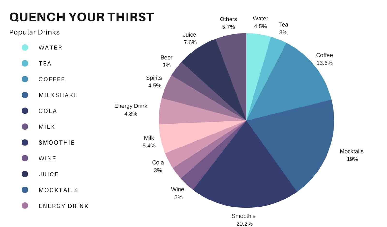
As seen in the above image, you should probably ditch the pie chart when:
- The percentage differences between angles are not wide apart
- When you have four or more slices
- When representing time-series data
Don’t even use pie charts if you can help it. Ultimately, the data determines your display method, but Bar charts remain a better alternative to pie charts because they show accurate quantitative comparisons at first glance.
Tips for Better Data Visualization
Ready to create detailed, informative, and visually appealing data dashboards? Here are seven tips to get you started:
#Tip 1: Have a Clear Takeaway
The point of data visualization is to tell a data story, and like every form of communication, it aims to inform, influence, or highlight key trends.
You want to ensure that your audience gets the message quickly after viewing your visualizations.
Think of it as a souvenir you want your audience to take away from the data visualization party. What would you like your audience to gain from your dashboards? Keep that in mind as you choose your display methods.
#Tip 2: Clean Your Data First
It can be challenging to represent raw data as appealing visualizations. If you are going to avoid frustration and cut down the workload, creating meaningful datasets should be your top priority.
For example, your data journey to visualization would probably start with aggregating data from various data sources in one data warehouse, such as Alteryx or Snowflake , and then cleaning and collating it into rich, organized datasets using very easy-to-use data transformation tools like Datameer .
Doing this makes it easy to generate clear, extensive data visualization dashboards.
#Tip 3: Know Your Audience
This is more of a rule of thumb than a tip.
Who will be viewing the dashboards? And what resonates with them? Use your data to tell stories ending with clear, valuable insights for the data visualizer.
In addition, represent data using visualization methods your audience can relate with.
What do they already know? When telling stories with your data, every new insight should consider what your audience already knows and build on top of that.
Are they familiar with complex data visualization methods? If you represented your transformed data in Snowflake using tree maps, would they understand it? If not, then you might need to train your audience first.
#Tip 4: Consider the Final Format of Your Presentation
How your data will be viewed should influence your data visualization methods.
If the data analysis report is to be printed, then your focus should be on making it clear and readable. It should have footnotes and texts that draw your audience’s attention to the information you want them to focus on without becoming chartjunk.
But if the data visualization is for a presentation, say, at your next boardroom meeting, it should have less detail because more focus would be on walking your audience through the data story.
The data display type should be optimized for easy interaction for data visualization shared online.
#Tip 5: Avoid Chartjunk
Chartjunk is a term that describes all unnecessary texts and visual elements that distract the audience from the significant insights in your data visualization.
A way to keep the focus on your data and avoid noisy background is to stay away from distracting fonts and use bold text sparingly so as not to lose the critical information the texts carry.
A general guideline here is that; if it is not needed to make the data visualization more understandable, skip it!
#Tip 6: Cite Your Data Sources
Data visualization should communicate credibility to your audience.
Even internal company data, including the source and the date it was generated, makes it more reliable and allows people to fact-check what is presented.
#Tip 7: Choose the Right Color Palette (///)
The idea of using colors in data visualization is to direct the audience’s attention to critical values. Picking the right colors is key to creating an appealing data visualization.
A quick tip in this regard is not to use more than five colors. Using too many colors can be harsh on the eyes and blur your audience to critical insights they need to focus on.
To make your designs more intuitive, use colors associated with certain factors. For example, you are using red colors in a geospatial map to represent locations with the highest churn rate for a social media app.
Conclusion
It is essential always to remember that the point of data visualization is quantitative and qualitative communication; whatever data display method you use should tell a story and should do this.
And clear visualization dashboards come from clean, transformed datasets. Are you looking to improve your data analysis process? Or tell better data stories using unique data visualization dashboards?
Let Datameer give you a boost by providing the most straightforward no SQL code required interfaces to model your data into transformed and organized tables ready for visualization.
Datameer gives you seamless access to all that data stored on Snowflake and allows you to transform it using either SQL, no code, or both. It is an excellent way for different teams in your organization to work with the data they need and their skills, and hey! This might reduce the coffee breaks at the office.