The How-To Guide On Data Visualization
- Datameer, Inc.
- July 2, 2022
This article will be your how-to guide on data visualization. We’ll discuss how to approach your data, the pre-requisites for creating good visualizations, and how to decide which visualizations tell your audience the best story.
We build dashboards and reports in marketing as part of our analysis process.
Your marketing dashboards and reports are a means to inform and educate your audience on the truth hidden within the data.
To achieve this, we need to tell our story correctly.
This requires imaginative ability and the ingenuity to transform information into knowledge using good visuals.
Let’s dive in!
What is Data Visualization?
An article by IBM describes data visualization as “ the representation of data through common graphics, such as charts, plots, infographics, and even animations.”
We can transform complex data relationships into meaningful and easy-to-digest information with quality visualizations.
The Why of Data Visualization
It’s no news that in marketing today, most of our quantitative analysis is carried out using charts and infographics.
The data visualization handbook by SAC cites that humans are more inclined to perceive visual cues faster than non-visual cues. A human gets the sense of a visual scene in less than 1/10 of a second.
Researchers also state that color visuals increase the willingness to read by 80%.
It sounds like a lot of psychology, right?… Stick around; you’ll see why it’s important to us marketers.
As marketers, understanding how our audience (humans) perceive visuals can assist us in creating quality and highly-engaging visuals when designing and developing our reports and dashboards.
3 Pre-requisites for Creating Good Marketing Visualizations
1. Craft Your Message: Before you begin creating visualizations, you should determine beforehand the type of story you want to tell.
Ask yourself the following questions:
- Who is my audience?
- How well do I know my audience?
- What questions do I want to answer with my data?
2. Know Your Purpose and Data
Before you start digging into your data and trying to create visualizations that answer business questions, it is essential to clean, wrangle and model your data appropriately.
Two main data types that can be used to model some aspects of your data are; numerical Variables known as measures and categorical variables termed “dimensions.”
Ask yourself the following questions:
- What kind of relationships exists within my data and datasets?
- What data wrangling and modeling techniques do I employ on this data?
3. Understanding the Art of Data Visualization
We previously addressed the psychological effects associated with colors as well as other statistics relating to data visualization.
To create good data visualizations, you have to understand the art of data visualization: i.e., how to use the right fonts, color palette, chart size, and themes to highlight the most critical details on your dashboards.
Ask yourself these questions:
- What are the best techniques for displaying these?
Do I need a chart (overview), a table (details), or maybe both to convey your message?
- Can I highlight specific data points to better get my message across?
- Is every piece being pulled together to create a cohesive story?
Selecting the right visualization: When and How?
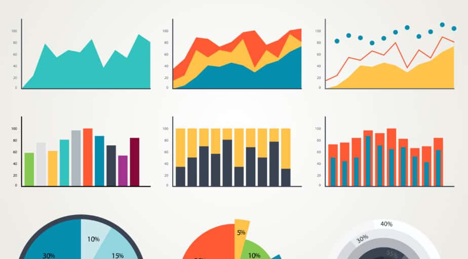
There is a befitting chart for every metric or KPI you are trying to measure to help you communicate your story to your audience.
Visual cues are of four types: points, lines, bars/columns, and boxes.
This section will discuss the most common chart types used in marketing and their use cases.
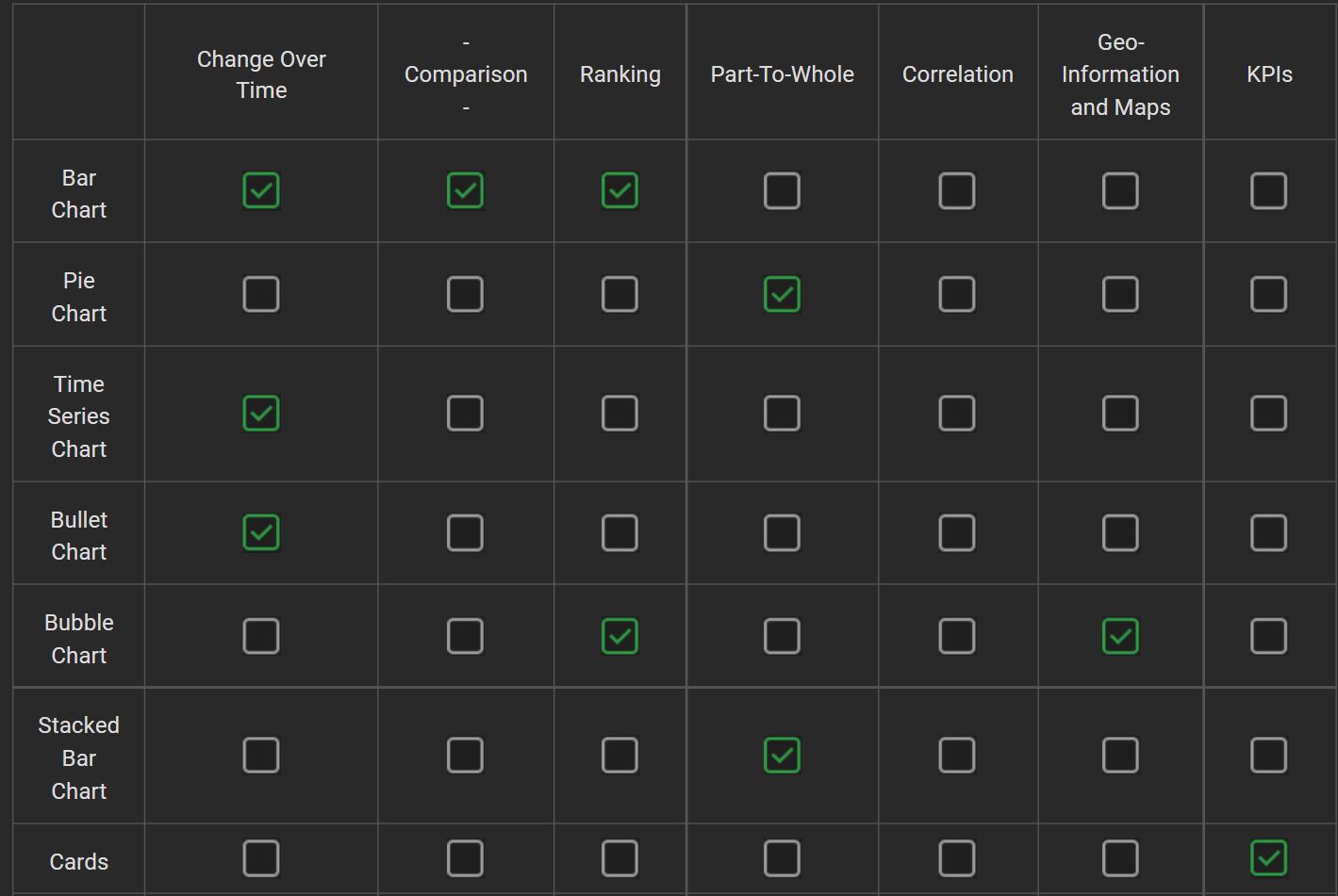
1. Comparison
Shows the comparison of categorical values where the data does not have any intrinsic order, for example, a list of products.
Some examples of this chart type include Trellis Charts, Stacked Bar charts, Marimekko, etc.
2. Change Over Time
It shows how a measure changes over time and allows you to highlight temporal trends. Some examples of this chart type include Line Charts, Bar Charts, bullet, and time series.

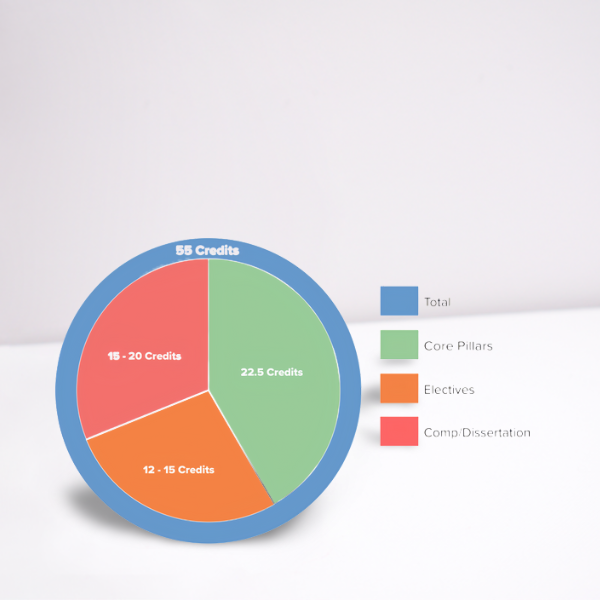
3. Part-To-Whole
A Part-to-Whole relationship shows how to measure
values that make up the whole of something (for example, the number of containers sold) compare to one another and how they each compare to the whole.
Some examples of this chart type include Pie charts, Stacked Bar charts, etc.
4. KPIs
Shows a measure on a tile. Some examples of this chart type include Number Cards or charts.

5. Ranking
Shows the top or bottom N values to emphasize
the most significant or smallest values.
Some examples of this chart type include A bar chart showing categorical values in decreasing or increasing order, a cluster bubble, etc.
6. Correlation
It shows whether there is a potential correlation
between the two measures. Some examples of this chart type include Scatter plots, Trellis, and Bubble Charts.
7. Geographical Information and Maps
Shows the geographical distribution of measure values. Some examples of this chart type include Chloropleth Charts and Geo-bubble visualizations.

Additional Considerations & Pro-Tips
For your business to reap the benefits of data visualizations, you need to create a visual design standard that incorporates best practices.
Luckily, The International Business Communications Standards (IBCS), a non-profit organization, established a relatively comprehensive and detailed visual standard for designing reports and presentations.
Here are a few pro-tips for you to consider when designing your next marketing dashboards:
- Less is more: Make every pixel and word count
- Avoid decorative use of graphics
- Avoid three-dimensional chart types
- Avoid pie charts
- Start bar charts at zero
- Use bullet graphs instead of gauges to save space
- Use sparklines to show trends on the X-axis.
- Show time going from left to right on the X-axis.
- Use color only to highlight or accentuate meaning.
What’s next in your guide on data visualization?
As a marketing analyst, it’s important to note that data visualization and reporting sit on top of the data pyramid.
Data has to be acquired, engineered, and consolidated in a data warehouse such as Snowflake before reporting and building dashboards.
And that’s where Datameer is king.
Datameer is a SaaS data transformation solution that combines your team — data engineers, scientists, and marketing analysts on a single platform to transform collaboratively and model data directly in Snowflake.
If you’ve already got a Snowflake DW setup, plug in your Datameer account and experience speedy data transformation today!