What is Data Visualization? A Complete Introductory Overview
- Justin Reynolds
- December 7, 2019
Demand for data and analytics is stronger than ever before. One study, for example, revealed that 79 percent of executives believe that avoiding big data could result in losing to competitors—and may even lead to extinction.
There’s a big difference, though, between collecting data and effectively using it to drive profits and improve operations. Data needs to be processed, prepared, and organized in order to be of any use, and a key part of the refining process involves making data easily understandable for employees.
This is why data visualization—the process of graphically representing data sets—is becoming an increasingly integral part of many enterprise’s operations.
Why is data visualization necessary?
For most people, it’s much easier to read a colorful and organized chart than to sift through data in a spreadsheet or report.
The brain, after all, has to store information in order to process it. By making data highly visual—meaning clean, organized, colorful, and easy to read—it’s much easier for most of us to make sense of it.
In fact, researchers have found that the human brain processes visuals 60,000 times faster than text. What’s more, 90 percent of all information transmitted to the brain is visual.
Add it all up, and data visualization is a no-brainer.
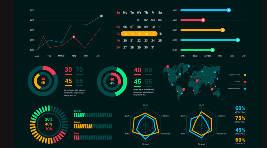
Selecting the Right Visualizations
We’re moving beyond the spreadsheet era and into the digital age. The proliferation of modern, SaaS-based platforms has made it easier to present data in a way that is visually pleasing to end users—and much more “exciting” than looking at spreadsheets.
Visualizations can vary depending on the type of data category you’re working with. When it boils down to it, there are a seemingly infinite number of ways to present data. Before getting started, it will help to have a clear understanding of what it is you want to show. That way, you can narrow down your selection and tell a compelling story with your data.
Here are some categories to consider when approaching your data:
Distributions
If you want to compare multiple distributions of numeric data, you may consider using either a histogram or a boxplot.
Generally speaking, histograms should be used when there is a similar sample size and only a few different comparisons to be made. Otherwise, the graph may appear overly busy and difficult to read. On the other hand, a box plot will let you see if your dataset is symmetrical or skewed.
Relationships
Relationships describe data connections across different tables and spreadsheets. To visualize correlations, try using either a scatter plot, a bubble chart, or a heatmap.
Connections can be demonstrated using arc or chord diagrams, connection maps, network diagrams, and tree diagrams, to name a few. Heatmaps and marimekko charts can also be used to describe relationships.
Compositions
Data compositions, or part-to-whole relationships, can be communicated in many different ways.
To narrow down your selection, you’ll want to first determine if your data is dynamic or static. Dynamic data could be visualized using stacked columns or area charts, for example. Static data is best organized using column charts, area charts, and pie charts.
Data comparisons
Comparisons indicate differences across values. To compare multiple items, you may want to explore using tables or bar charts. You could also compare data over time using line or area charts.
As you can see, there are countless types of visualization options to use. These are just a few examples to help point you in the right direction. Try experimenting with different visualizations and, over time, you’ll figure out how to present your data in the most effective way.
Challenges of data visualization
Data visualization can be very simple if you’re working with a narrow dataset. If not, it can be extremely complicated. It largely depends on what you’re analyzing and what you need to communicate.
With that in mind, let’s examine some common challenges associated with data visualization.
Rising complexity
Business data is becoming increasingly complex with each passing year. These days, companies are pulling data from sources like IoT devices, sensors, and apps—none of which may communicate with one another.
For this reason, businesses need to be very careful about how they approach large and complex datasets. It’s important to have a thorough understanding of each individual data structure in order to determine the visualization that can most accurately represent it.
Oversimplification
Part of the challenge of representing big data is breaking it down to a point where it’s digestible and compelling—without making it too simple. For example, when working with millions of data points, it’s easy to draw conclusions while overlooking intricacies and patterns.
As new data processing tools are coming to market, many businesses are looking for ways to put analysis into the hands of ordinary workers who lack deep technical knowledge. While this is more easily achieved with the right tools in place, businesses should be careful about taking this approach. Without proper tools, data communication should be left to trained experts to avoid drawing incorrect conclusions.
Sharing and collaborating
Accepting and embracing error is a fundamental part of the data analysis and visualization process. This, of course, can be frustrating—especially if you’re analyzing information alone. Through collaboration, departments can work together to discover unique trends and exchange visualization input—collaborating on analytics assets and sharing knowledge across the organization.
Data Transformation is Critical
Effective data visualization starts and ends with clean, organized, and processed data. How you transform your data is critical to this, in terms of both process and how. FP&A is assembled by analyzing complex and diverse datasets that need to be cleansed, blended, and shaped into final form. Often times this involves high degrees of collaboration between data engineering and analytics teams. It also requires rich data documentation to back up compliance processes.
Datameer is a powerful SaaS data transformation platform that runs in Snowflake – your modern, scalable cloud data warehouse – that combines to provide a highly scalable and flexible environment to transform your data into meaningful analytics. With Datameer, you can:
- Allow your non-technical analytics team members to work with your complex data without the need to write code using Datameer’s no-code and low-code data transformation interfaces,
- Collaborate amongst technical and non-technical team members to build data models and the data transformation flows to fulfill these models, each using their skills and knowledge
- Fully enrich analytics datasets to add even more flavor to your analysis using the diverse array of graphical formulas and functions,
- Generate rich documentation and add user-supplied attributes, comments, tags, and more to share searchable knowledge about your data across the entire analytics community,
- Use the catalog-like documentation features to crowd-source your data governance processes for greater data democratization and data literacy,
- Maintain full audit trails of how data is transformed and used by the community to further enable your governance and compliance processes,
- Deploy and execute data transformation models directly in Snowflake to gain the scalability your need over your large volumes of data while keeping compute and storage costs low.
Learn more about our innovative SaaS data transformation solution, Sign up for your free trial today!