How to create a funnel chart visualization in Looker?
- Looker FAQs
- January 15, 2018

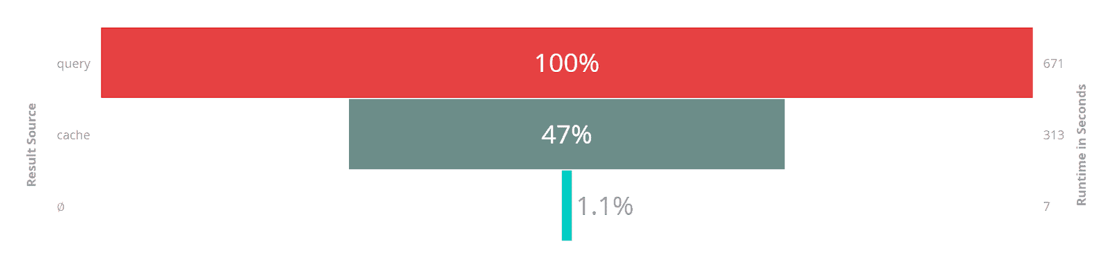
A Funnel chart is best used to understand the linear sequence of events, such as search movement on a travel website.
The largest bar of a funnel chart should always represent 100%, and then each subsequent bar would represent a certain percentage of the largest bar. Usually, the first stage in the process is the largest (100 percent), and each progressive stage decreases.
For example:
Creating a funnel chart visualization in Looker:
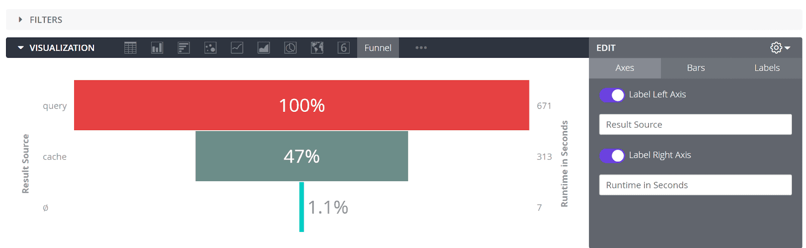
We can create funnel visualization by clicking the Funnel option in the Visualization bar of Looker Explore. A funnel chart consists of a single set of numbers and labels. In the Looker data table, this information can be oriented vertically or horizontally.
This chart can work with both pivoted data and non-pivoted data. Funnel charts can plot at most 50 bars. If the data contains more than 50 rows or 50 columns, one should use the Row Limit or Column Limit option to limit the rows or columns to 50 or less.
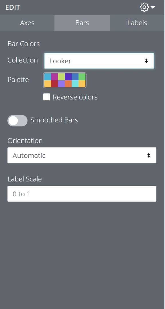
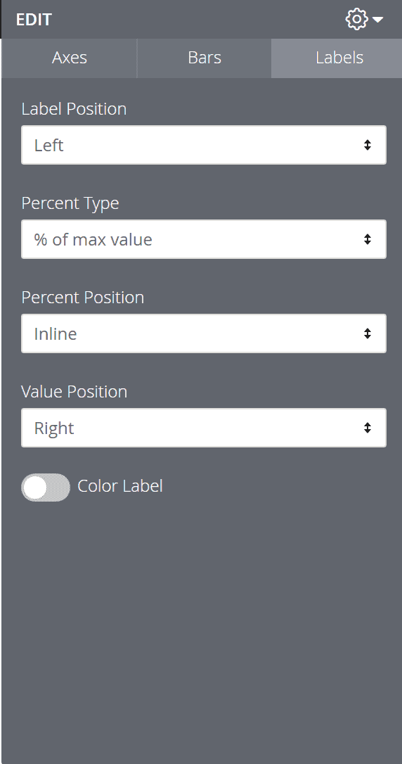
There are three menu options for the Funnel Visualization, and the field options are self-explanatory:
- Axis Menu Options:
- Bars Menu Options
- Labels Menu Options
Up Next:
Read How to add custom visualization in Looker using javascript?