Visual Exploration
Introduction to Visual Explorer
Datameer's Visual Explorer is an interactive data analysis feature designed to quickly and easily understand your data. With the purchase of Visual Explorer, you can instantly explore up to billions of records with sub-second response times when optimally configured. The data is first displayed visually over different types of charts where you can drill in and add/adjust attributes or aggregations. When the initial data exploration has been completed, the findings are added to a worksheet within your workbook where further analysis can be made. Visual Explorer integrates with Hadoop via YARN working seamlessly on multi-tenant clusters.
Visual Explorer is enabled with the setup of the Runtime Analytics engine.
Accessing Visual Explorer
To access the visual exploration feature:
- Open a workbook.
- Navigate to the worksheet you want to visually explore.
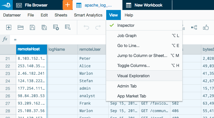
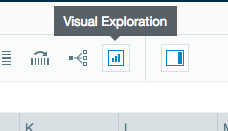
- Select View from the menu bar and select Visual Exploration or click the Visual Exploration icon on the toolbar.
Shortcut to visually explore a column in a worksheet:
- Open a workbook.
- Navigate to the worksheet you want to visually explore.
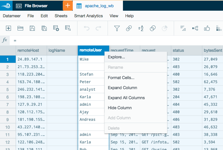
- Right-click on a column name and select Explore.
Using Visual Explorer
Using chart previews
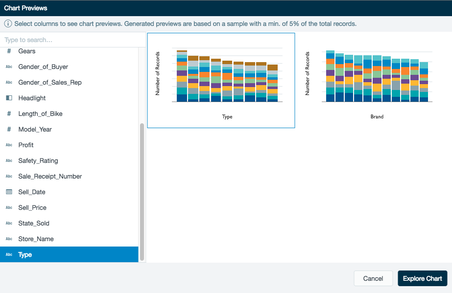
After selecting the Visual Explorer feature, a chart preview dialog pops up in the workbook to help you start exploring your data. You can now select one or more columns and the chart preview starts populating with suggestions based on the data types and column cardinality.
If a numeric column isn't selected, the total number of records of the worksheet is used as the default measurement.
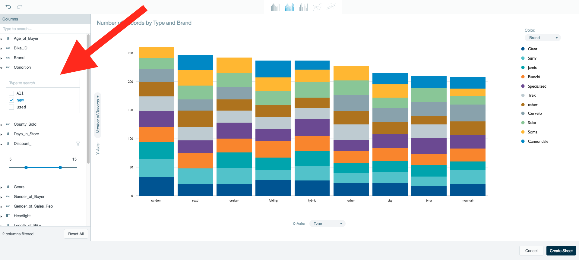
Selecting column(s) to explore
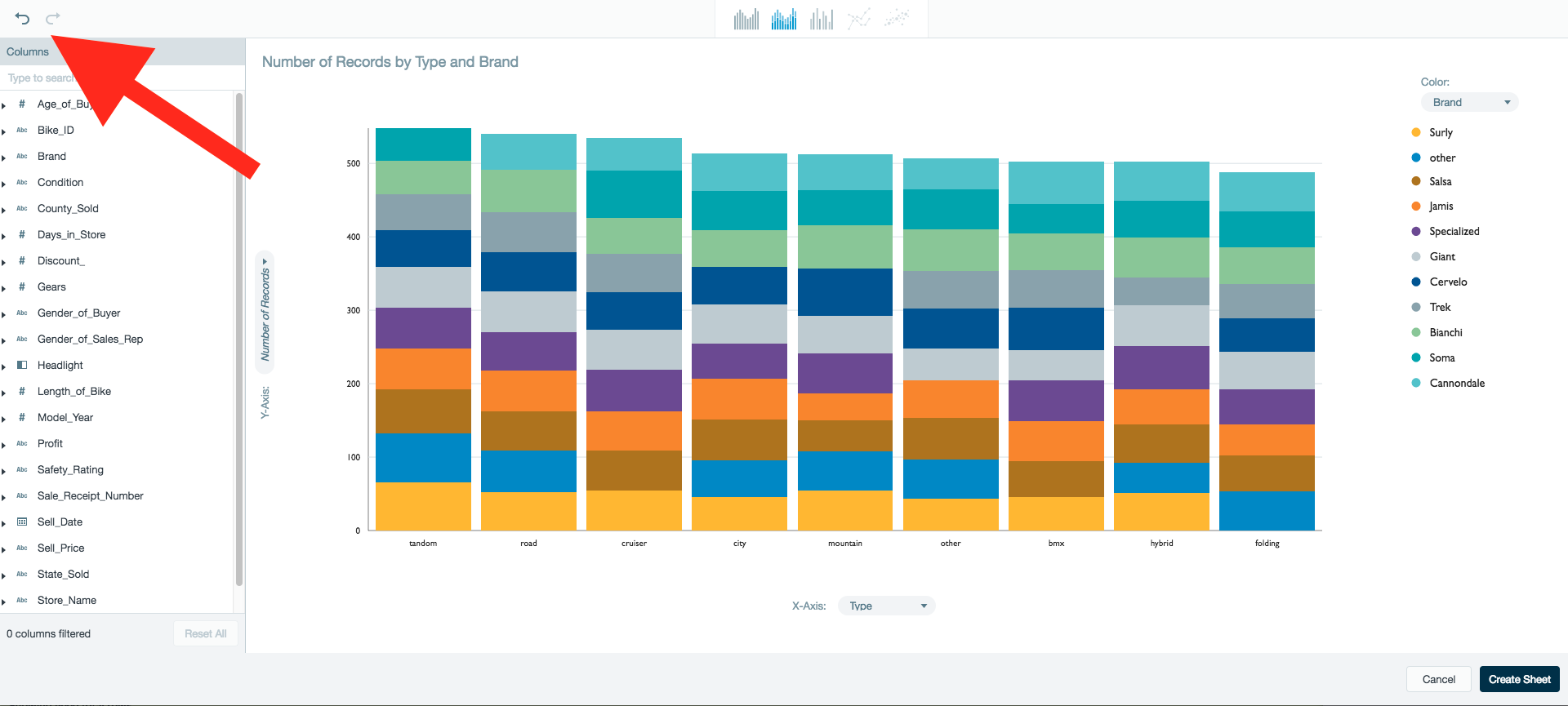
All of the columns on the current worksheet are listed on the left. Select a column by clicking the column name. When a column has been selected it is shown as highlighted. Single-click on multiple column names to add additional columns to the preview. Single-click a highlighted column to remove the column from the preview. A search function for column names on the worksheet is located above the column name list.
Selecting a preview chart
Auto generated preview charts of the selected columns are displayed on the right. Click on the chart you want to explore and click Explore Chart.
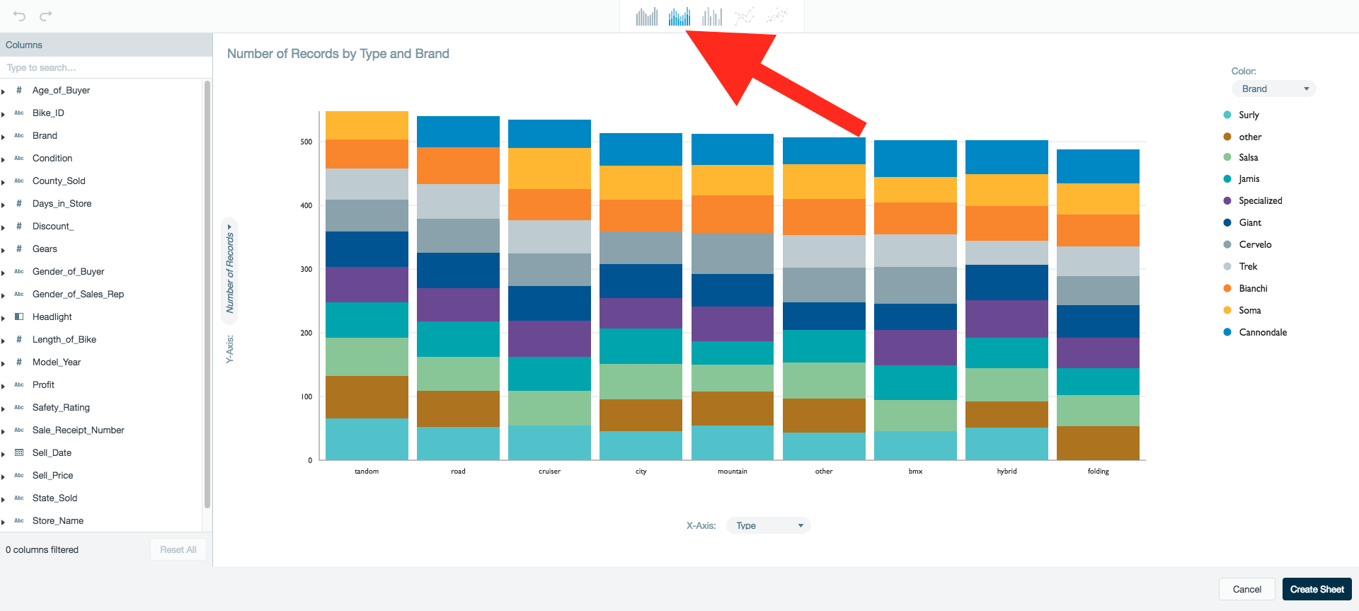
Only one chart is selectable at a time. You can change the type of chart used to view the data later from within the Visual Explorer. For example, If you first select to view the column data as a line chart and later want to view the same data as stacked bar chart, click the appropriate icon at the top of the Visual Explorer box.
Limitations of the chart preview
The generated previews are based on a sample of the dataset with a minimum of 5% of the total records. The actual charts can look different than the previews as actual charts are generated from the full dataset.
Exploring data
After selecting the initial columns and a chart format, a chart is generated using the total records from the imported data source. At this time you can start analyzing your data through visual exploration.
Read a use case example of the Visual Explorer feature on the Datameer's knowledge base: <Link to VE use case on the knowledge base>
Supported charts
- Bar chart
- Stacked bar chart
- Grouped bar chart
- Line chart
- Scatter plot
The possible charts available are based on the type of data being selected for your visual exploration.
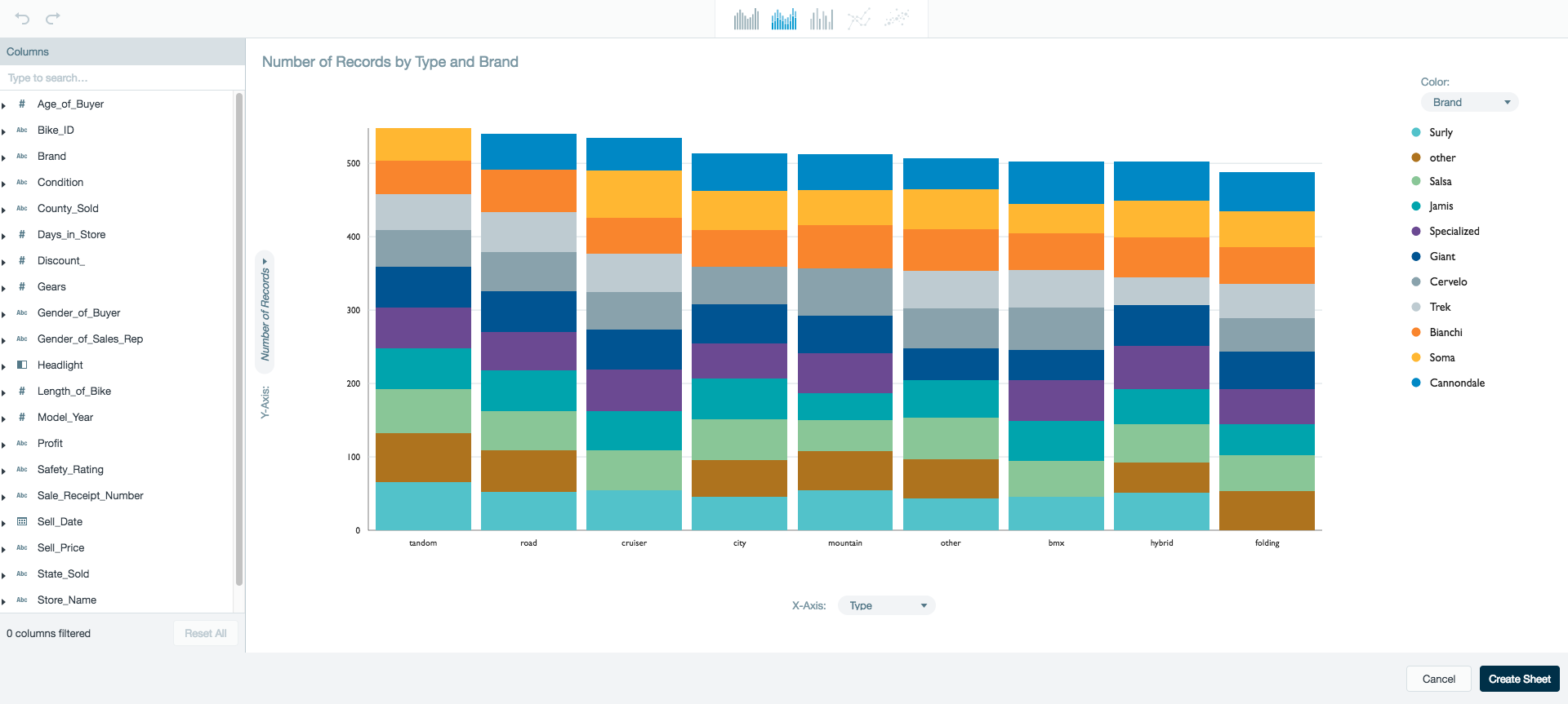
Reading charts
View the current chart type or select a new chart type for your data visualization from the chart type tool bar located at the top of the box.
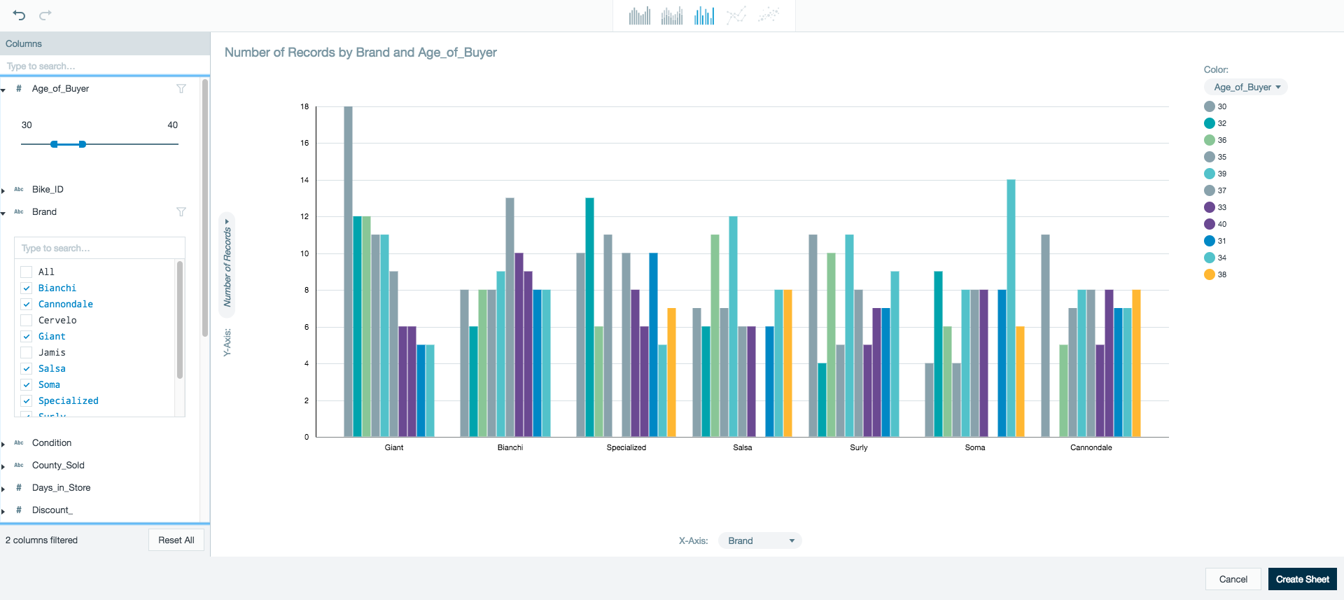
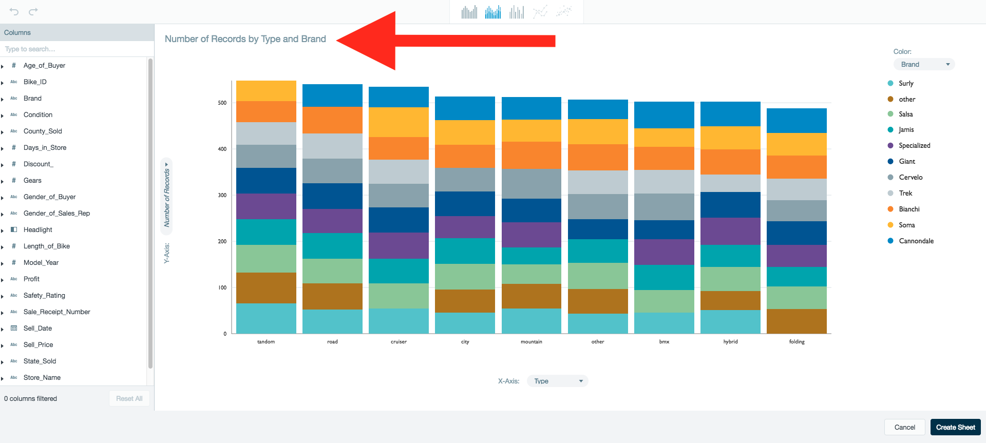
The auto-generated chart title is located above the chart. This title identifies the columns being used in the chart as well as the how the columns are being measured.
Example: Number of Records by Brand and Age_of_Buyer. This lets you know the chart is displaying the total number of records in your dataset filtered by the brand value and age_of_buyer value.
Mouseover any of the sections on the chart to view the underlying data.
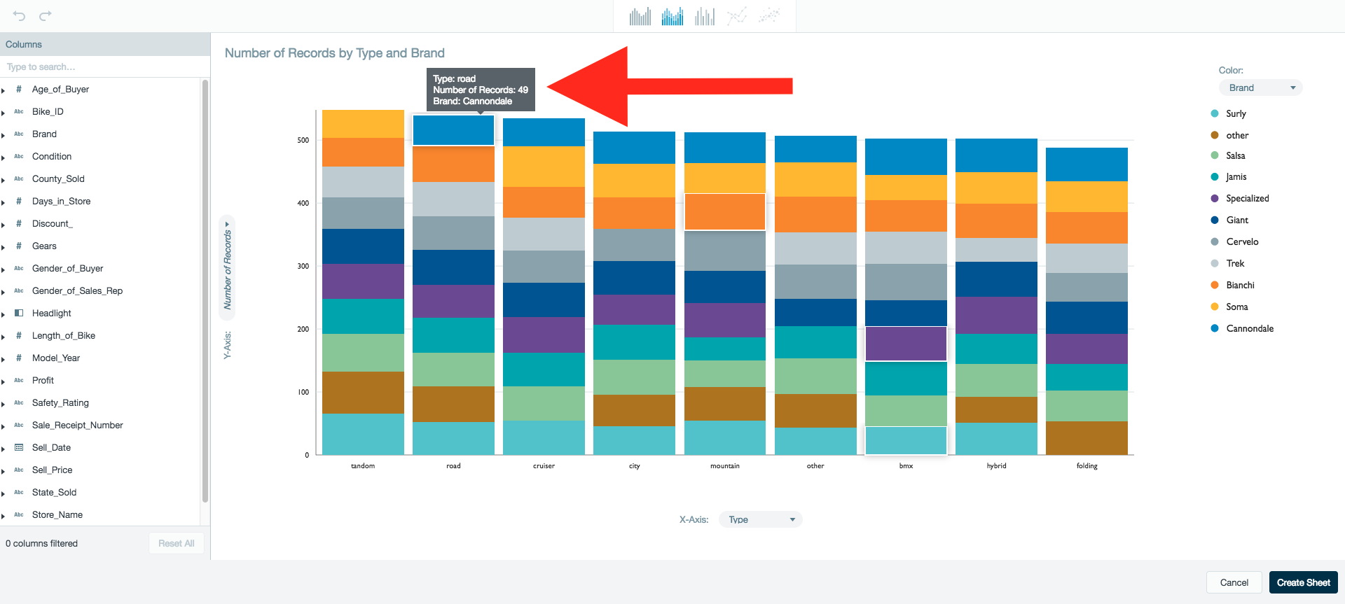
The X and Y axis labels identify the columns they represent and if a measurement is being used.
Example: If the Y axis is Number of Records, it is displaying the total number of records for each X axis column.
The color legend on the right side defines what column is being measured and the color assigned to each value.
The column being measured in terms of the current X and Y axis can be changed from the drop down menu located under the Color heading.
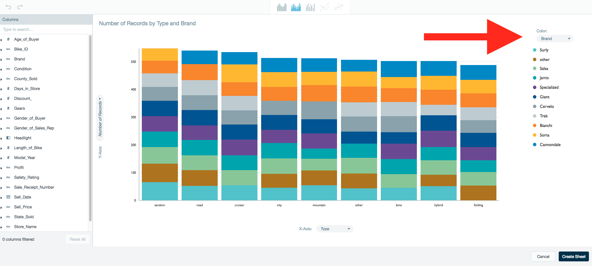
The column that the color legend represents should have a low cardinality. If the column selected has over 14 colors, the colors begin to repeat.
Configuring charts
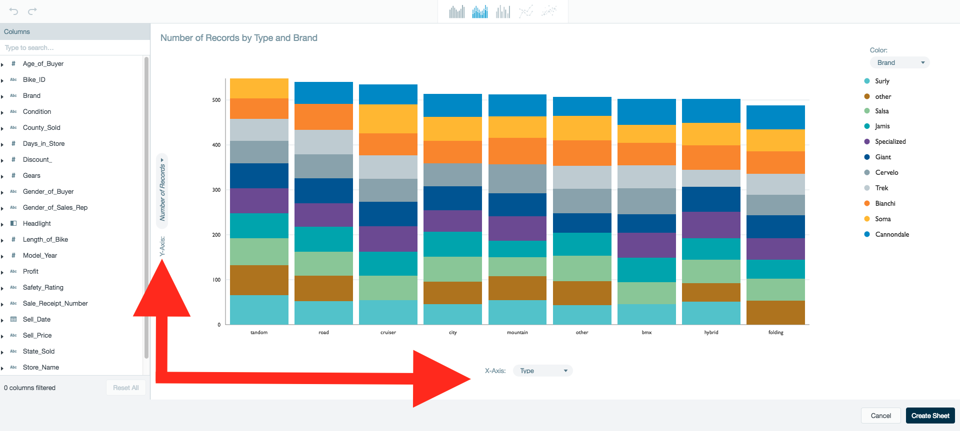
The X-axis, Y-axis, an Color conditions can be updated directly from a chart. Click the condition name next to the label to select a new column to replace the previous column on the chart.
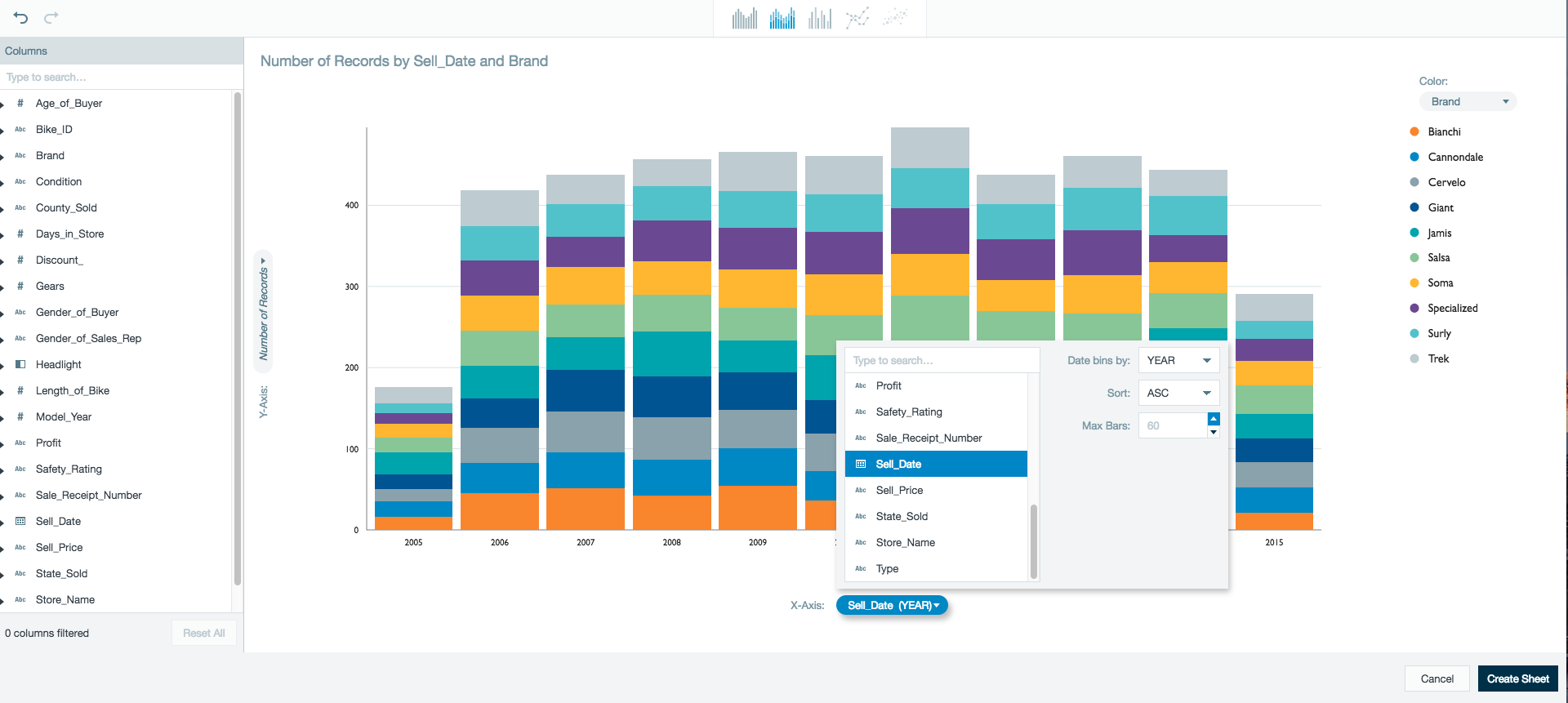
Additional options are available dependant on the chart and condition type.
X-axis options for bar type charts:
- Date type columns have options to sort by bins. (E.g., Year, Quarter, Month,...). The default setting is AUTO. This bin settings selects a bin based on the cardinality of the data.
- Date type columns have the option to sort by ascending or descending dates.
- All column types have the option to limit the maximum number of bars displayed.
X-axis options for line charts:
- Date type columns have options to sort by bins. (E.g., Year, Quarter, Month,...). The default setting is AUTO. This bin settings selects a bin based on the cardinality of the data.
Y-axis options for bar type charts:
- The Y-axis can only be changed to numeric type columns from the worksheet or the total number of records in relation to the X-axis.
- Y-axis worksheet columns have the option to assign the aggregation function used to display the column values (E.g., SUM, COUNT, AVERAGE, MIN, and MAX).
- The option to sort by ascending or descending values.
Y-axis options for line charts:
- The Y-axis can only be changed to numeric type columns from the worksheet or the total number of records in relation to the X-axis.
- Y-axis worksheet columns have the option to assign the aggregation function used to display the column values (E.g., SUM, COUNT, AVERAGE, MIN, and MAX).
X-axis and Y-axis for scatter charts:
- Both the X-axis and Y-axis for scatter charts must be numerical values.
Color options for bar, line, and scatter type charts:
- The Color condition can be changed to NONE so this condition isn't displayed on the chart.
- Date type columns have options to sort by bins. (E.g., Year, Quarter, Month,...). The default setting is AUTO. This bin settings selects a bin based on the cardinality of the data.
Filtering column data
The data being visualized can be refined by using filters.
The column filter list displays all the columns in the worksheet. Select a column and define which values of that column should be included in the visualization.
Non-case sensitive strings can be entered into the search bar to located a specific column name.
They data type of the column selected corresponds to a filter type:
- Numeric - range slider
- Data - range slider with date/time selector
- Boolean - radio buttons
- String -
- Low cardinality - checkbox list
- Medium cardinality - starts/doesn't start with search box
- High cardinality - free text search box
Further exploration into the data: Drill in or zoom
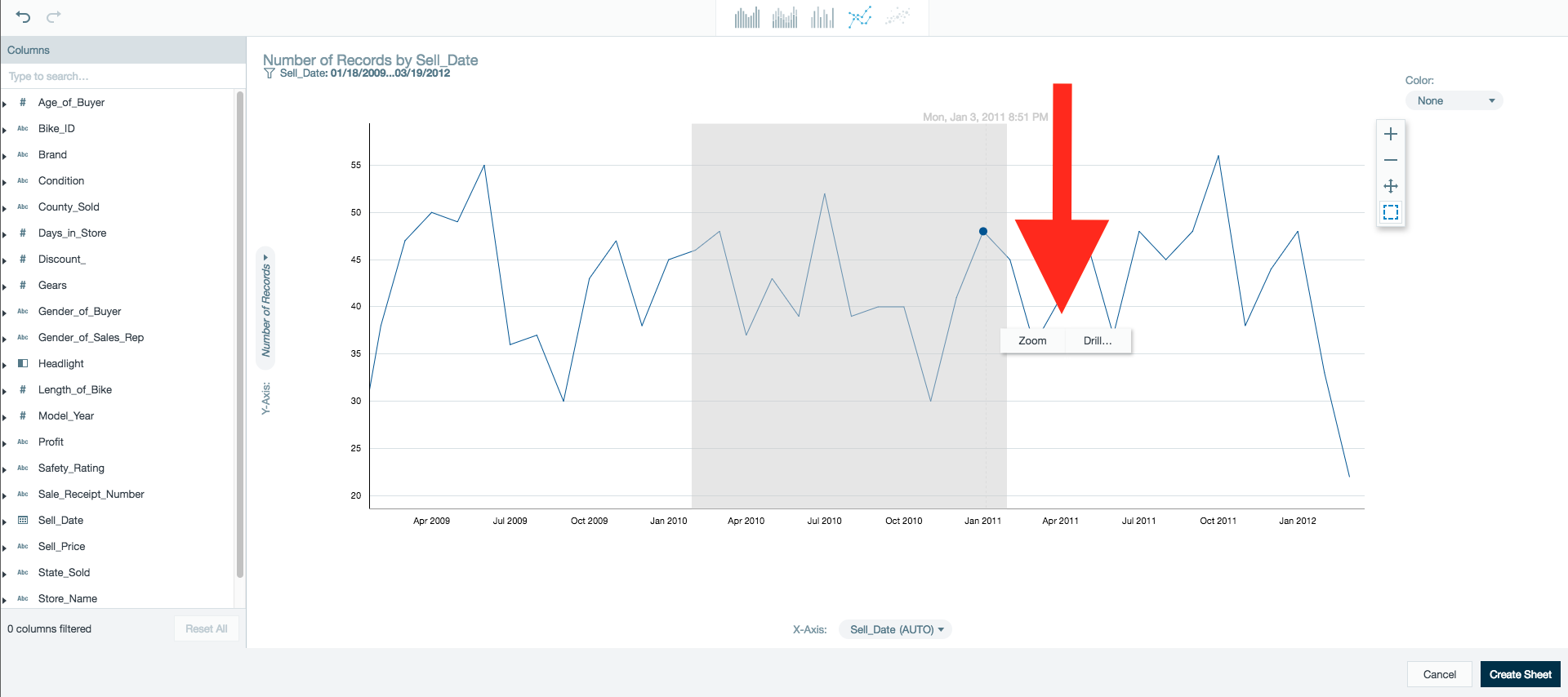
Datameer's Visual Explorer allows you to drill down or zoom into your data helping you understand what it means from every perspecitve.
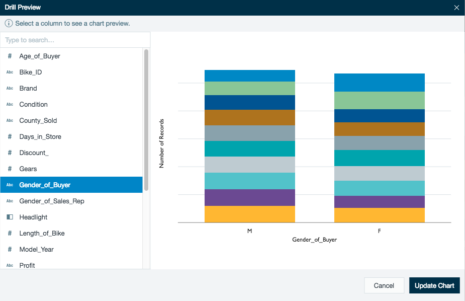
From the visual exploration of a bar chart, select the part or parts of the data you're interested in further exploring. Next, click on the Drill button.
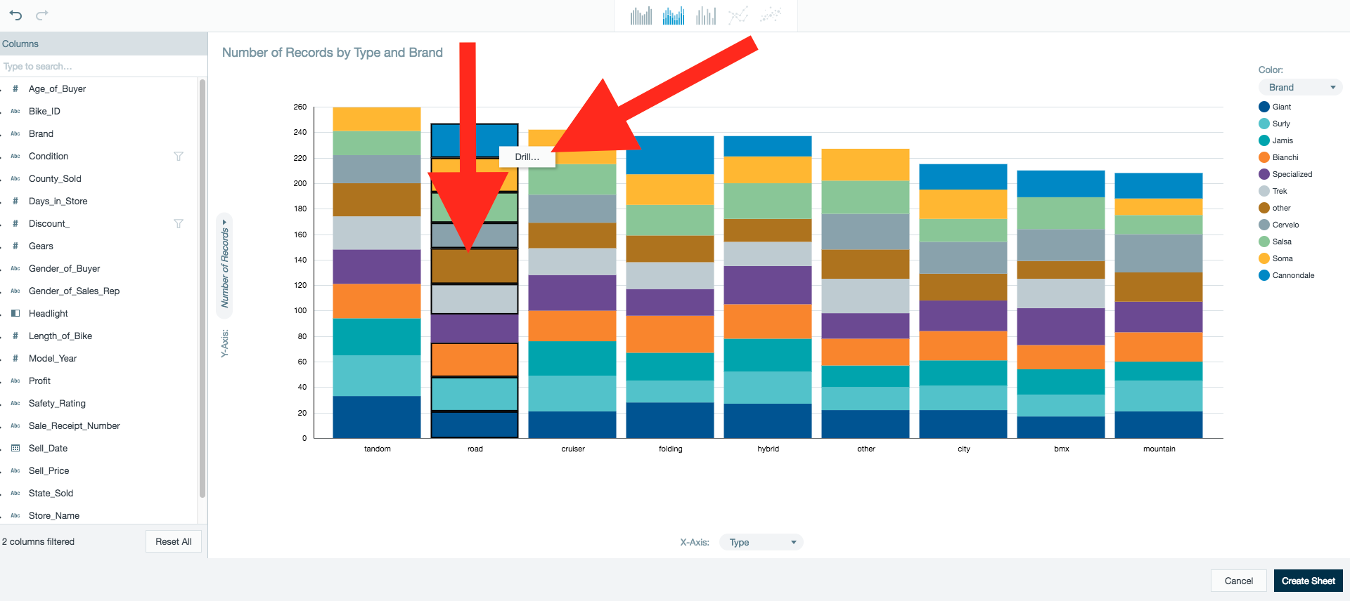
Similar to the original chart preview, you can select a column from your worksheet you would like to apply to drill into your data.
The selected column replaces the current dimension of the chart. (I.e., The x-axis is replaced by the selected column.)
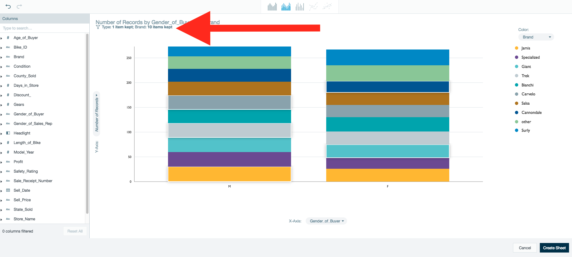
After updating your chart, the new drill down condition is applied to your visualization.
The kept dimensions for the new drilled in chart are summarised below the auto-generated title. More details become available when mousing over the dimension.
When drilling further into your data, the newly kept dimensions are added to the line.
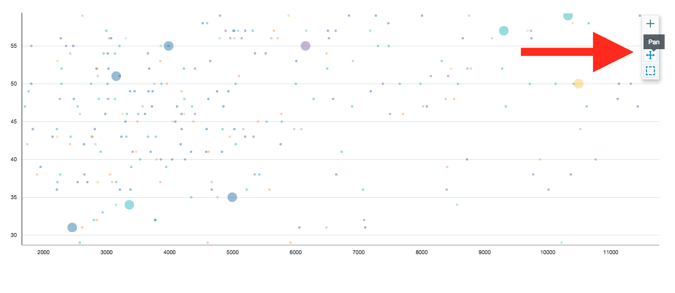
Users have the ability to zoom in on data when using line or scatter plot visualizations and the x-axis is represented by a column where auto-binning is applied.
Use the menu on the right side of the screen to zoom in/out by bins or highlight/pan a section on the visualization to zoom or drill into.
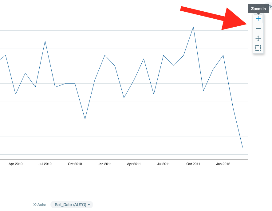
After zooming in, use the Pan option to navigate the chart.
Using the undo/redo features
It is possible to undo or redo your last action in Visual Explorer by clicking the Undo or Redo button on the top left of the screen.
Creating and Using a Visual Explorer Worksheet
After using the visual tools to explore your data, move that data you have found into a worksheet of your workbook for further analyzation.
Create a Visual Explorer worksheet
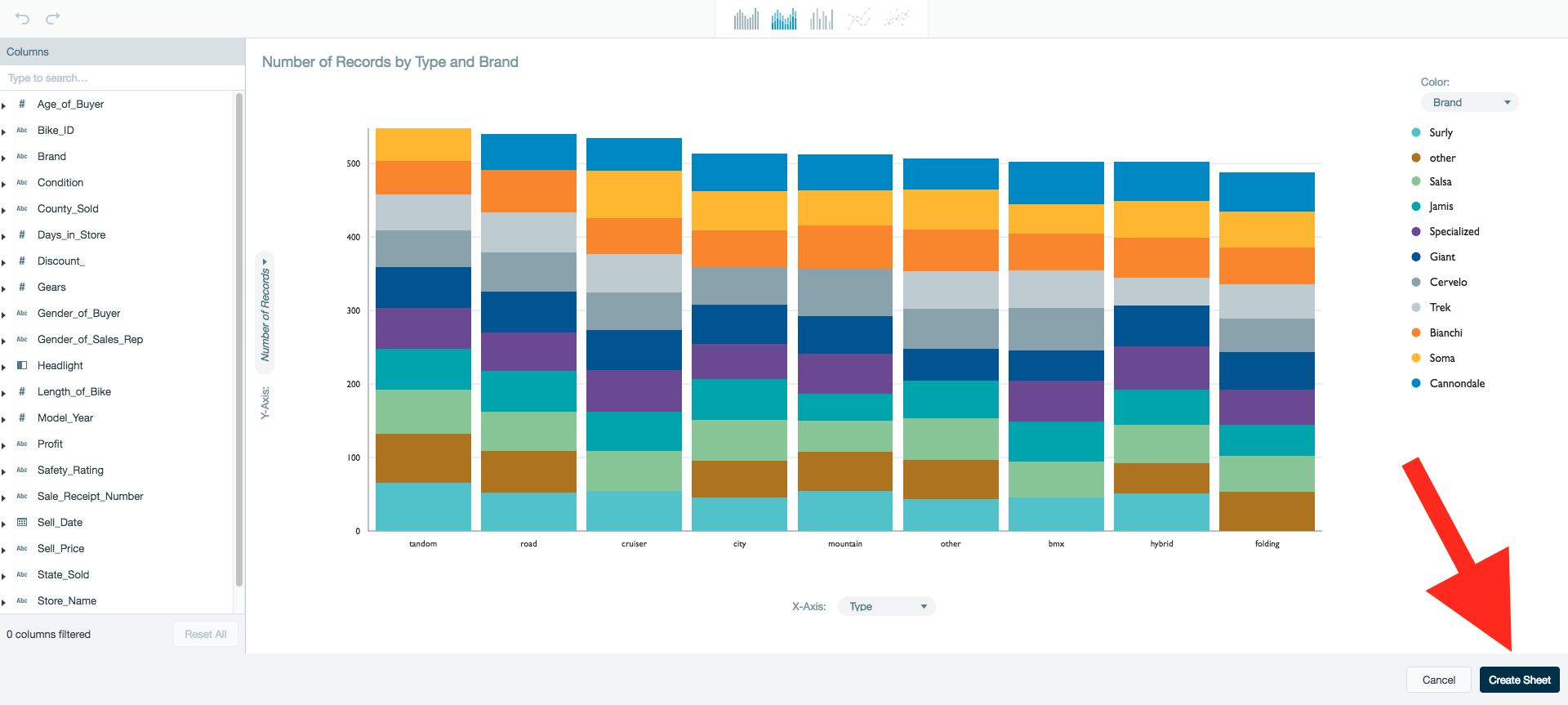
Create a worksheet at any time during visual exploration by clicking Create Sheet on the bottom right of the screen.
Summary or Details sheet
As of Datameer 7.4, you can select to create a summary or details worksheet from your visual exploration.
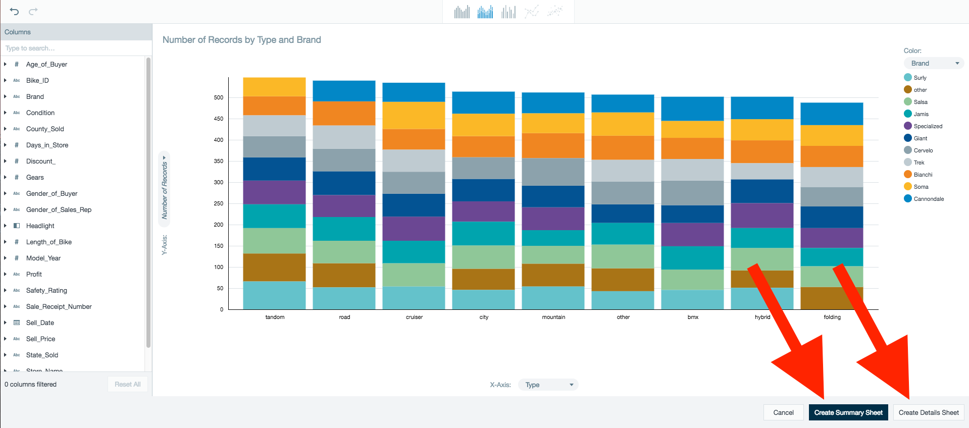
Summary sheet
A sheet with the aggregate summary of your visual exploration. Your summary displays the columns of data you selected during the visual exploration in a worksheet.
Details sheet
A sheet with the detailed dataset from the visual exploration source sheet. Your detailed sheet is the visually explored data with your filters applied to all the underlying detailed data.
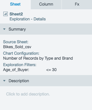
Viewing the Inspector of Visual Explorer worksheet
Like all worksheets in a workbook, a sheet inspector is available to give you useful insights into your data.
As of Datameer 7.4
Clicking on the Sheet tab in the inspector of a visual exploration sheet also has a Summary section for both Summary and Details sheet types.
The Summary section displays the following meta data for the sheet:
- The name of the source sheet used.
- A description of the chart configuration used to generate the sheet.
- A description of any exploration filters added from the visual exploration. Workbook filters added from Filtering Data are not displayed in this section.
Return to Visual Explorer from a worksheet
To return to the visual exploration feature from the worksheet, select View from the menu bar and select Visual Exploration or click the Visual Exploration icon on the toolbar.
Known limitations and constraints
- Columns of the list data type are not represented in Visual Explorer.
- Visual Explorer worksheets are read-only and can't be edited directly.
- If a Visual Explorer worksheet has downstream worksheets and the Exploration chart is edited, changes can result in errors as column names are not propagated to downstream worksheets.
- Filters which have been applied through the filter panel or on chart actions like Drill or Zoom aren't represented in the worksheet view. Those filters are represented in the query of the worksheet info dialog.
- The length of string values displayed in Visual Explorer is limited by a constant configurable from the Runtime Analytics Plug-in under advanced settings. The default setting is 16. String value results that are over this setting are not accounted for in Visual Explorer or a worksheet created from it. Increasing the accepted string lenght might lead to longer computation times.