Syrian Refugee Crisis
This app uses simple functions and analytics to find insights about migration patterns, asylum application success, and funding status for Syrian refugees.
Infographics
The app aims to enhance awareness about the Syrian refugee crisis as well as improve service provision for refugees who need continuous funding to finance their urgent needs. To create infographics, this app combines data from the UN Refugee Agency (UNHCR), which measures UNHCR's populations of concern for a given year and country of residence and/or origin in their Population Statistics survey, with data from the Financial Tracking Service, which measures funding numbers in their Syrian Arab Republic: Funding received 2012, 2013, 2014, and 2015 surveys.
The app analyzes and then presents the following sections in the infographics:
- Demographic Information. This section breaks down refugee demographics and contains the Migration Patterns before 2011 chart, which shows where most Syrian refugees migrated to prior to 2011. The Migration Patterns During 2011-2014 chart shows where Syrian refugees migrated to from 2011 to 2014. The Family Types Within Top 10 Destinations breaks down the number of refugees by sex and age for each of the top ten migration destinations.
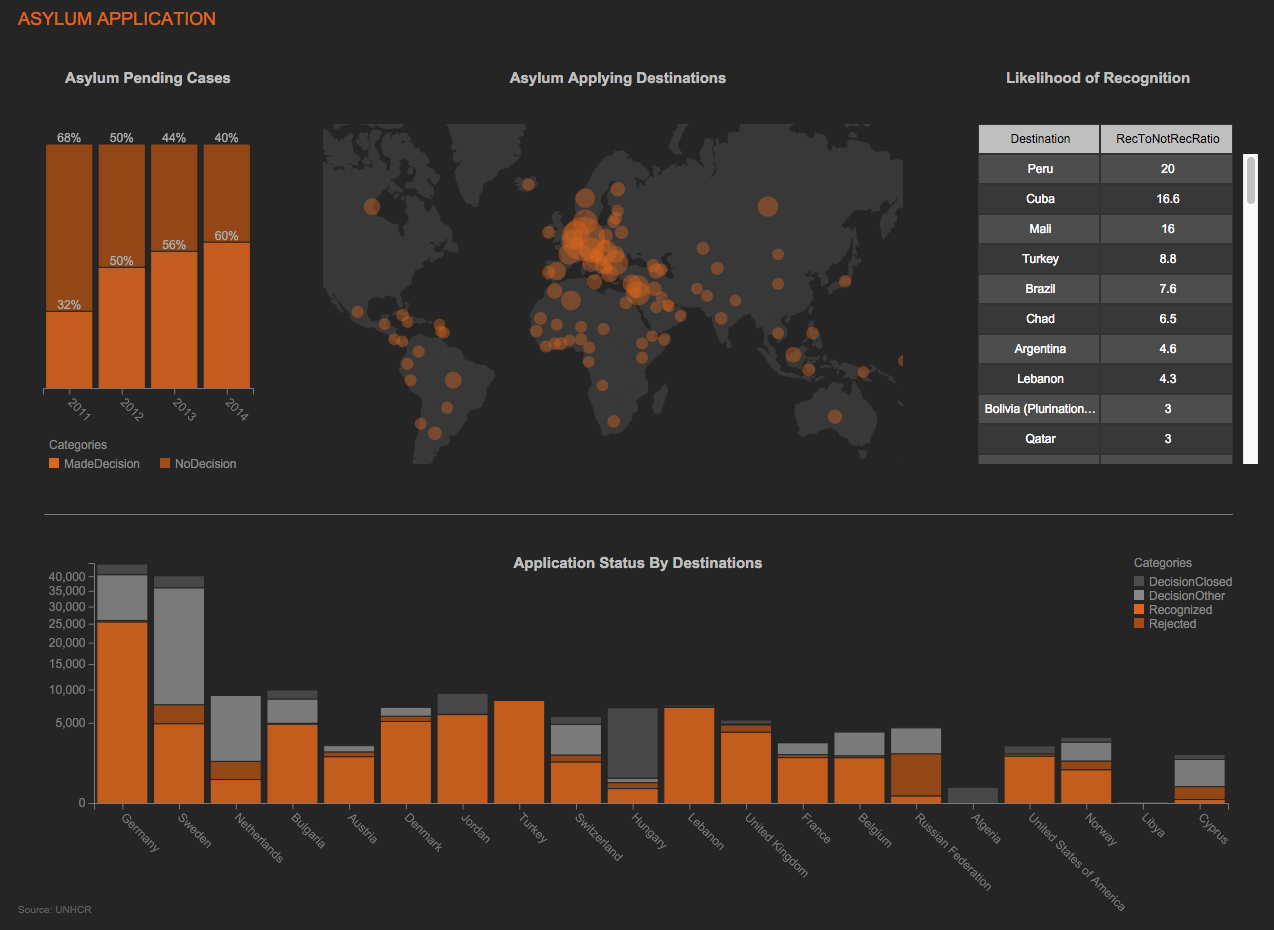
- Asylum Application Status. This section shows the status of asylum applications for refugees in four charts. The Asylum Pending Cases chart breaks down how many applications had a decision made for a given year. The Asylum Applying Destinations map illustrates how many refugees applied for asylum in each of the top 20 countries.The Likelihood of Recognition chart shows the ratio of recognition for each country, comparing recognized to not recognized. Finally, the Application Status by Destination chart details the application status for asylum seekers by country.
- Funding Status. This section shows the funding status for refugees for 2015. The Funding Trends graph compares how much funding was received in each year and how much was unmet, while the Distribution of Funds chart shows where the money was allocated. Finally, the Sectoral Differences chart illustrates how well each sector, such as health or sanitation, was covered for a given year of funding.
File Uploads
The infographics use the following file uploads:
- CountryLongLatitude
- Demographic
- DistanceData
- Funding 2012
- Funding 2013
- Funding 2014
- Funding 2015
- Refugee
- Status_AsylumSeekers
Workbooks
The Refugee_Analysis and Funding_Analysis workbooks provide the data for the charts in the infographic, which use basic functions to organize the data. The Family Types Within Top 10 Destinations graph joins the number and type of refugees migrating to each country with the distance of that country from Syria in the "JoinedDistance" sheet of the Refugee_Analysis workbook. To create the Asylum Applying Destinations map, the data for the status and destination of the refugees is joined with the longitude and latitude of the destination in the "JoinedStatusGeo" sheet.