Smart Analytics Tutorial
The Smart Analytics Tutorial app details a case study involving a bank attempting to correlate all its data to the products they are selling. Using Datameer Smart Analytics, you can see how raw data can be turned into valuable insights.
This app contains sample demo data from a bank that ran a campaign to encourage people to buy products from them. The goals of this app are to:
- Show that you can discover the profile of a successful and unsuccessful contact
- Identify the activities the bank can take (e.g., when to call, how long to call) to improve the efficiency of the campaign
This app has four folders, one for each algorithm that Datameer currently offers. In each folder you see:
- Demo workbook (which has the raw data which you can use to test the algorithms)
- Results workbook (which contains the results of actions that are documented below)
- Sample infographic (for Column Dependencies and Clustering algorithms)
Data Import
The first step the bank must complete is uploading its relevant data into Datameer. In the main Smart Analytics Tutorial app folder you see four uploaded files (data) that are used with this app.
- Bank Data - General customer information
- All Users - Customer user names and IDs
- All Products - Product names and IDs
- Users Product Rating - The rating each user gave to the bank's products
Definition of columns
Bank client data:
- age (numeric)
- job: type of job (categorical: 'admin.','unknown','unemployed','management','housemaid','entrepreneur','student',
- 'blue-collar','self-employed','retired','technician','services')
- marital: marital status (categorical: 'married','divorced','single'; note: 'divorced' means divorced or widowed)
- education (categorical: 'unknown','secondary','primary','tertiary')
- default: has credit in default? (binary: 'yes','no')
- balance: average yearly balance, in euros (numeric)
- housing: has housing loan? (binary: 'yes','no')
- loan: has personal loan? (binary: 'yes','no')
Data related with the last contact of the current campaign
- contact: contact communication type (categorical: 'unknown','telephone','cellular')
- day: last contact day of the month (numeric)
- month: last contact month of year (categorical: 'jan', 'feb', 'mar', ..., 'nov', 'dec')
- duration: last contact duration, in seconds (numeric)
Other campaign attributes
- campaign: number of contacts performed during this campaign and for this client (numeric, includes last contact)
- TimeBtwCampaigns: number of days that passed by after the client was last contacted from a previous campaign (numeric, -1 means client was not previously contacted)
- NumOfCalls - previous: number of contacts performed before this campaign and for this client (numeric)
- CampaignSuccess - poutcome: outcome of the previous marketing campaign (categorical: 'unknown','other','failure','success')
- PurchasedProduct - has the client purchased a bank product? (binary: 'yes','no')
Workbooks and Infographics
Datameer Smart Analytics can be applied to data after it has been uploaded. The accompanying workbooks show sample analyses and are linked to infographics displaying the results.
Column dependencies
The uploaded general bank data is loaded into a workbook and will be analyzed with the column dependencies tool. Column dependencies help you understand relationships in your data. Use the workbooks in the Column Dependencies folder to recreate the analyses using this algorithm.
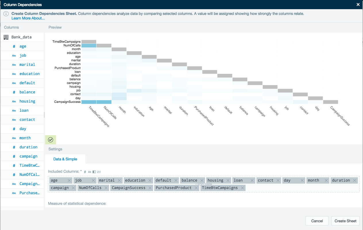
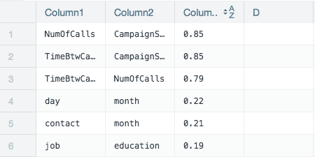
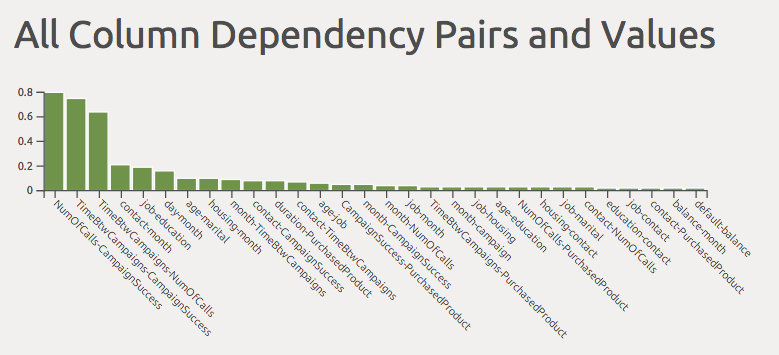
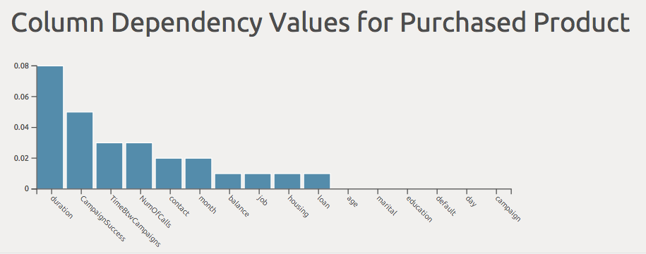
This tool evaluates how strongly each of the columns correlates with each other. From the preview graphic in this example, we can see that there are three column pairs (dark blue boxes) that have a high interdependency.
On a new worksheet the results are sorted in descending order to show how interdependent the column pairs are. The higher the value the more they correlate to each other.
An additional two sheets are created and used to present the results as infographics.

First concatenate the columns into pairs and display each pairs interdependency (worksheet 4 ColumnDependencyIFG).
Finally filter out the products purchased to ascertain which had the greatest impact. In this example the duration of the call had the greatest impact on the number of purchased products (worksheet 3 columnDependencyPurchased).
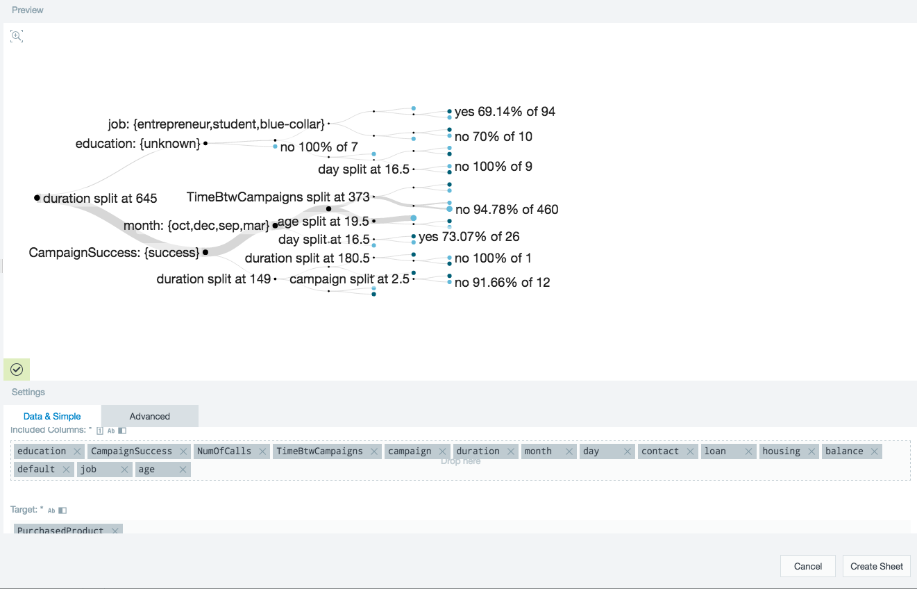
Clustering
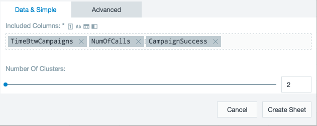
Clustering is used to group data objects together based upon unknown factors that are contained within the data. A way to quickly identify clusters is to use column dependencies. Use the workbooks in the Clustering folder to recreate the analyses using this algorithm.
Having identified the fields that had the greatest impact on customer purchases, the bank wants to refine to whom it targets its products. The number of clusters can be easily configured. Using the clustering tool, the top three columns according to the dependencies analysis are analyzed to find two clusters.
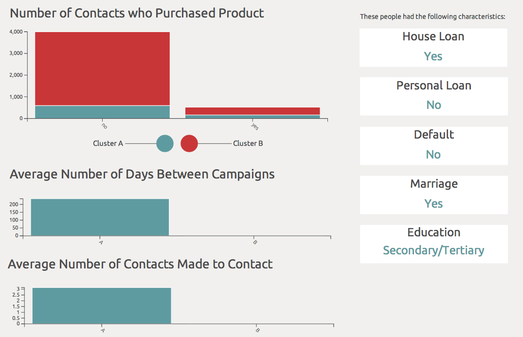
After creating a new cluster, you see a clusterId (A or B) assigned to each row in the new ClusterSheet. By analyzing the clusters created, you can discover the profile of unsuccessful contacts. For example, in the Purchased worksheet of the Result for Unsuccessful workbook (in the Clustering folder) this analysis includes leveraging the Datameer functions as follows: (1) GROUPBY the column ClusterId, (2) GROUPBY the column PurchasedProduct, and (3) GROUPCOUNT.
See the Result for Unsuccessful workbook for a summary of analyses done. After doing analysis on the clusters (as seen in the Result for Unsuccessful workbook) the following conclusions can be made:
- Most did not purchase a product from the bank.
- Since most did not purchase a product from the bank, the profile of an unsuccessful contact is seen in the infographic below.
- The biggest difference between clusters A and B had to do with the activities the bank executed. A business person could conclude that regardless of what the bank did, the contacts with the profile described in the infographic did not end up buying a product from the bank.
.![]()
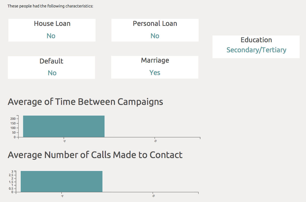
Now you can analyze successful contacts. To do that, you can filter the demo data set in the Clustering folder. Filter so that only the rows where PurchasedProduct is true appear. See the Results for Successful workbook for an example. After leveraging the same functions described above to analyze the data, you see a profile of the successful contact. The results are summarized in the infographic as seen below.

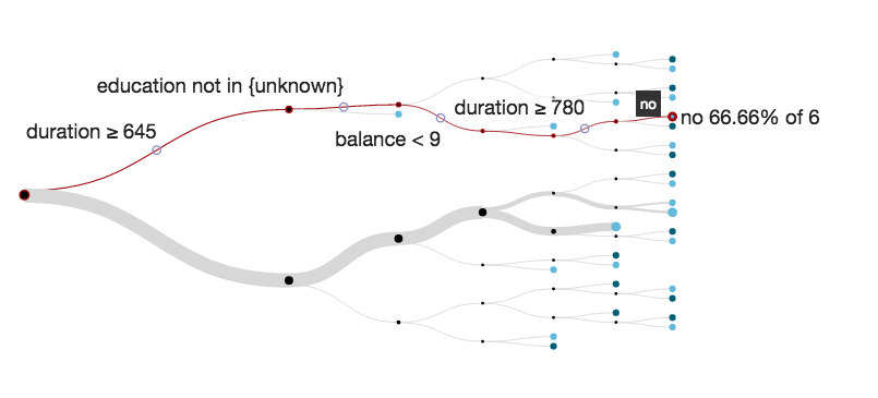
Decision tree
The general bank data is loaded into a workbook and analyzed with the decision tree tool. This tool gives a visual representation of the criteria that lead to a certain outcome.
The bank wants to find the major indicators that lead a customer to purchase a product. For the following decision tree, the target PurchasedProducts was used along with all of the bank's customer information.
The results pinpoint the major junctions where a critical decision was made to whether the product was purchased or not.
In the example below, the data shows that when the bank spent between 645 and 780 seconds on the phone with a customer (duration) and the balance in their account was under $9, then 66.66% of 6 contacts ended up not buying a product from the bank.
Recommendations
The recommendation engine automatically predicts the interests of a person based on historical observations of other people’s interests.
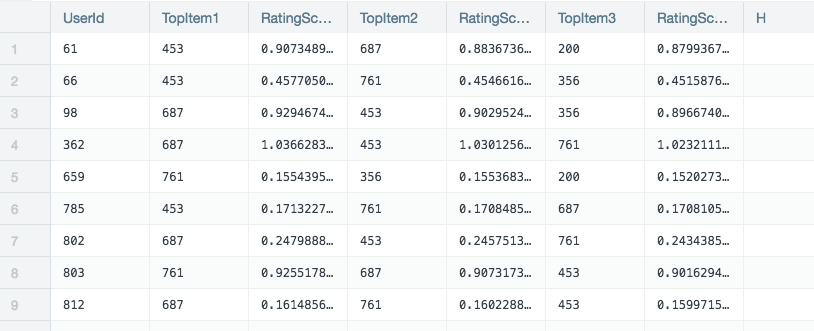
The user data, product data, and user product ratings are all added to a Datameer workbook. The recommendations tool requires users, products, and how those customers rate the products. This example is looking for the single most recommended product for each user.
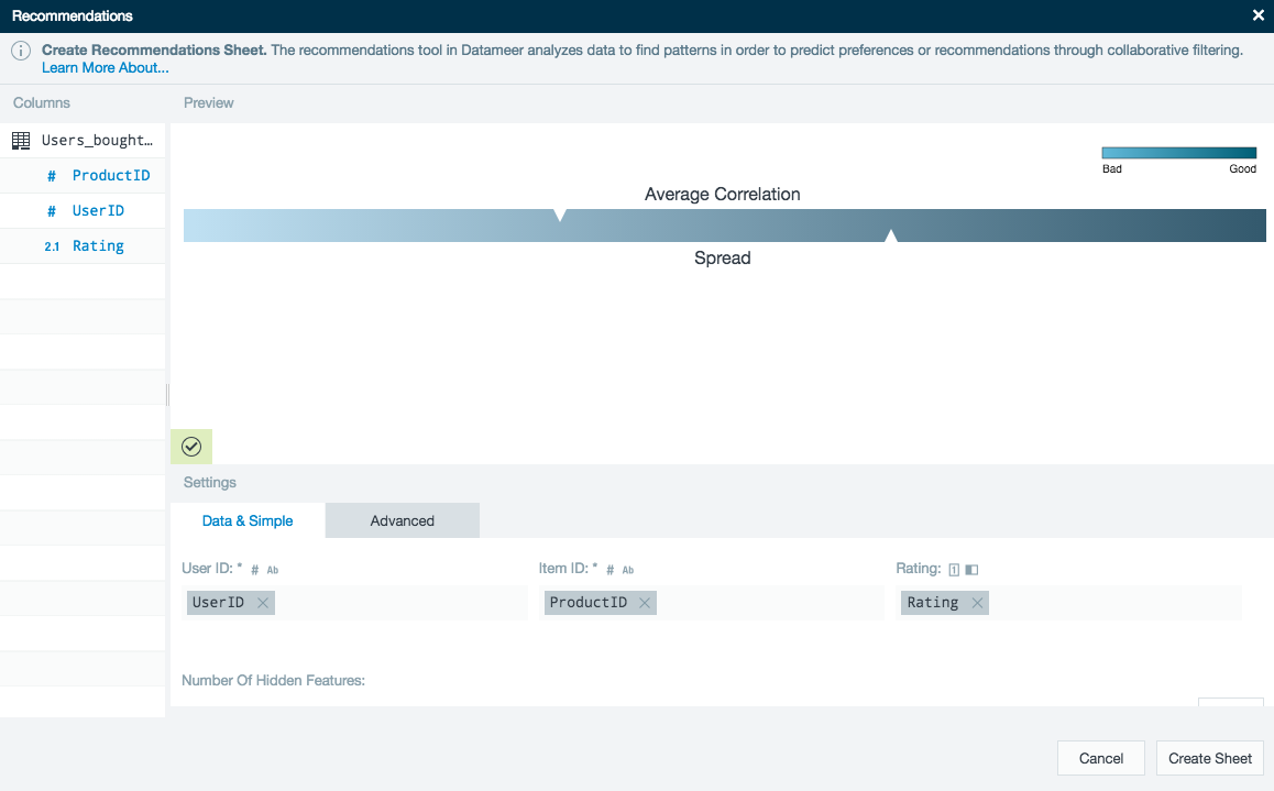
After the recommendations tool has completed the calculation a new worksheet is created showing the top rated product for each of the users.
Further analysis can be made by joining worksheets. The resulting worksheet shows in detail, the top recommended item for each user and how likely that user is to be interested in the recommended product.