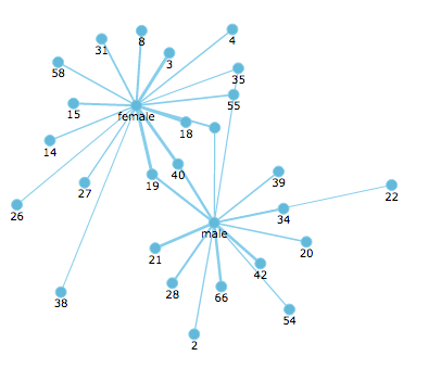
Network
Creates a network diagram. A network diagram is a visual representation tool that connects source data to show its relationship to the target data.
Configuring the Network Diagram
Here you can find out what kind of data can be represented as network diagram and what options you have to represent your data. General steps for configuring widgets are explained on the Visualizing Data page.
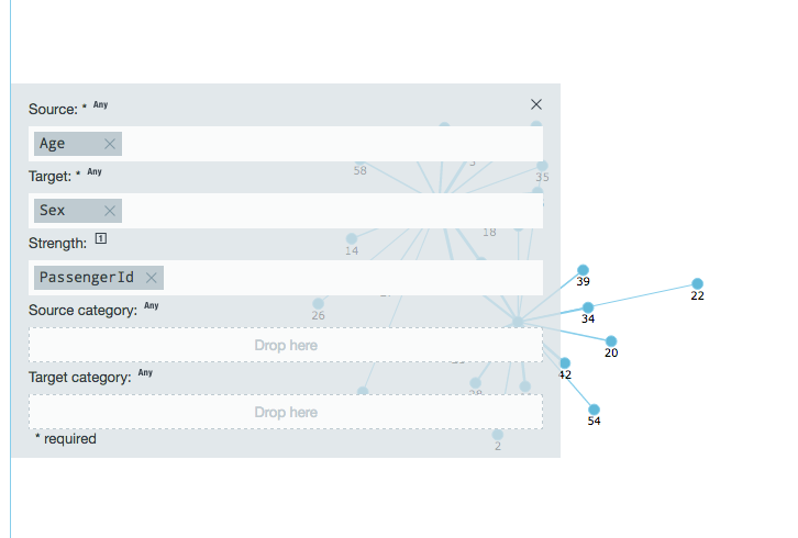
The Source category and Target category fields determine the colors of the points in the widget. If the source category is used, it determines the colors of the points. If the source category isn't used, the target category is used. If neither are specified, the points are all one color.
Data Requirements
You can use any type of Datameer supported data as the source or target data in a network diagram. The values to measure the strength must a number.
Appearance-Specific Settings
The appearance of a network chart can be adjusted through standard and specific settings.
Standard widget settings give you basic controls in order to customize a widget. Learn more about standard widget settings here.
Specific widget settings give you more controls over details pertaining to the network chart widget. With these controls, you can adjust your widgets to create the perfect infographic to fit your needs.
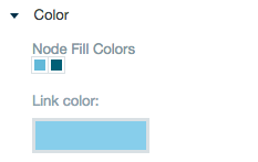
Color
Color settings let you adjust the color aspects of the widget. The top color bar represents the colors currently being used for the widget. Use the color wheel by clicking in a color box and selecting the color to add to that space.
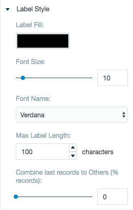
Labels
The label settings give you controls to adjust how labels are displayed on the widget. You can control the color, size, and type of fonts for the label.
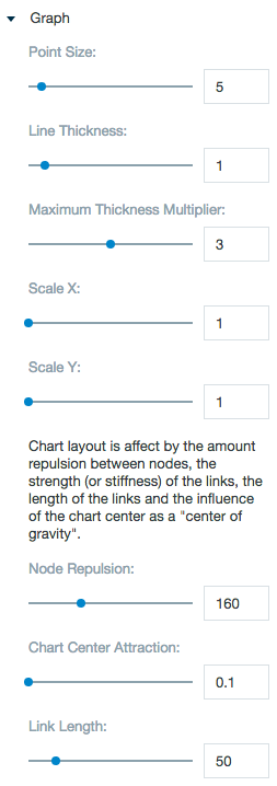
Graph
The graph setting let you adjust a wide range of settings pertaining to the network widget.