Getting Started Tutorial
Thanks for installing Datameer!
Here are a few pointers to help you get started.
Get Started with Your First Analysis
The simplest way to get comfortable with Datameer’s capabilities is to use this short tutorial to make your first analysis. In ten minutes, you can go from CSV data to a meaningful analytical infographic. For this tutorial, you calculate and visualize the average age of sample users based on the city they live in.
Working with this Tutorial (Datameer versions 7.4.+)
These instructions can be found in PDF format by opening Datameer (versions 7.4.x +) and right-clicking the file “Getting Started in the Datameer File Browser. Select Open to download this file and follow these instructions.
For Datameer versions prior to 7.4.x, please refer to the instructions found later in this section to complete the “Hello World” Tutorial.
To download the complete PDF, click the file below.
Part One: Workbook Analysis
In this section, you add data to your workbook and use some functions to prepare your data for visualization.
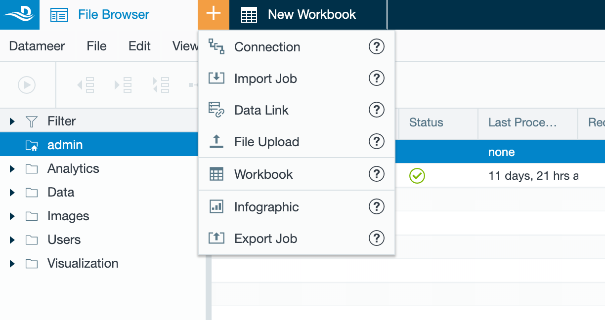
- In Datameer’s File Browser, select your home folder.
- From the plus (+) menu in the top bar, select Workbook.
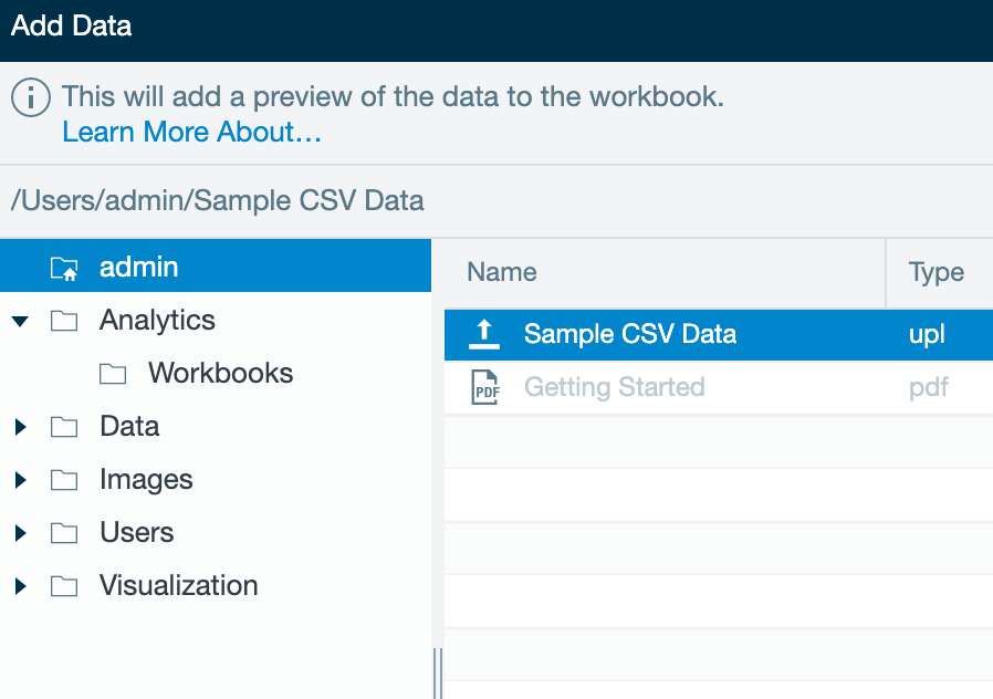
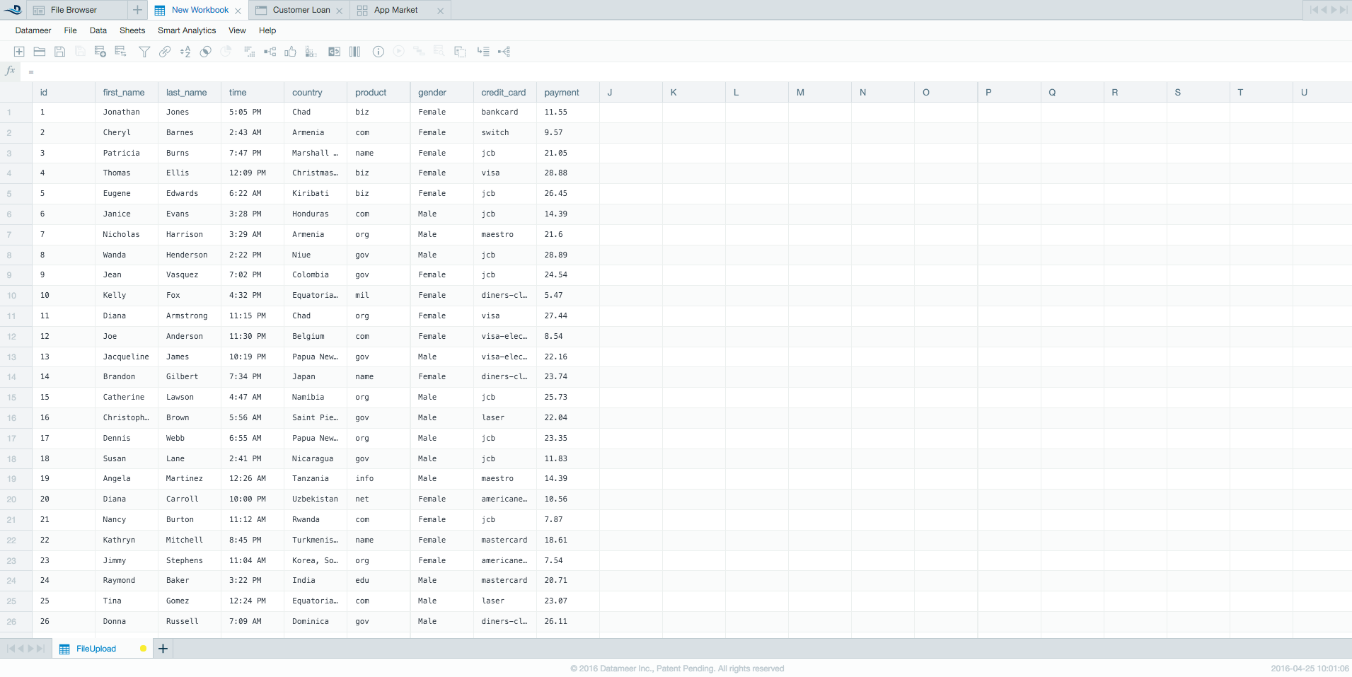
The Add Data window opens. - Select Sample CSV Data. Click Add Data. The workbook opens with the sample data.
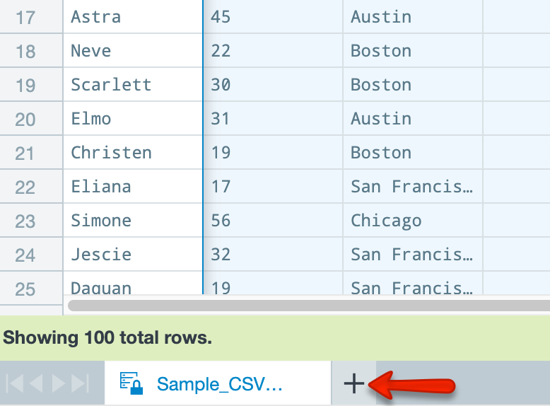
- Click the plus (+) icon next to the sheet name (Sample_ CSV_Data) at the bottom of the workbook to create a new sheet.
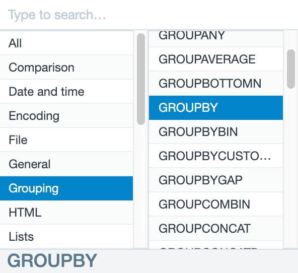
- In the Formula Builder select the Grouping category from the column on the left.
- Select GROUPBY. This function combines the different values (city, in this case) and groups them together so the data is more easily parsed.
- Add an argument by clicking the Sample_CSV_Data tab to return to the first sheet. If the Formula Builder covers the sheet names at the bottom, drag it to the right to find the Sample_CSV_Data sheet.
- Click the City column of the sheet. The Arguments field is populated.
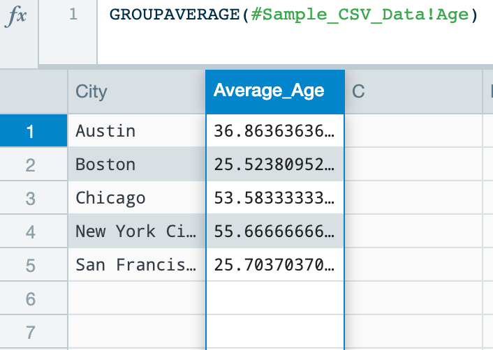
- Click OK. A new City column appears on Sheet1. Now the city values are aggregated to just show each unique city.
- Click in the second column (column B) of Sheet1 to add a second function.
- In the Formula Builder, select the Grouping category and GROUPAVERAGE function. This function uses the grouping already created (city) and calculates the average of another column (age) for that grouping.
- From the Sample_CSV_Data sheet, click the Age column for the argument.
- Click OK. A new Average_Age column appears on Sheet1. This shows the average age of the occupants per city.
- Save your workbook by clicking the Save Workbook icon.
- Name your workbook. In this example, use My Workbook.
- Click Save.
- At the bottom of the Workbook Settings page, select Start calculation process immediately after save.
- Click Save.
Part Two: Create a Visualization
Now that you’ve prepared your data, making a visualization helps you see relationships in the data. Datameer offers many different types of graphs and charts, but for this tutorial, you use a multi-bar chart to find the relationship between age and city location.
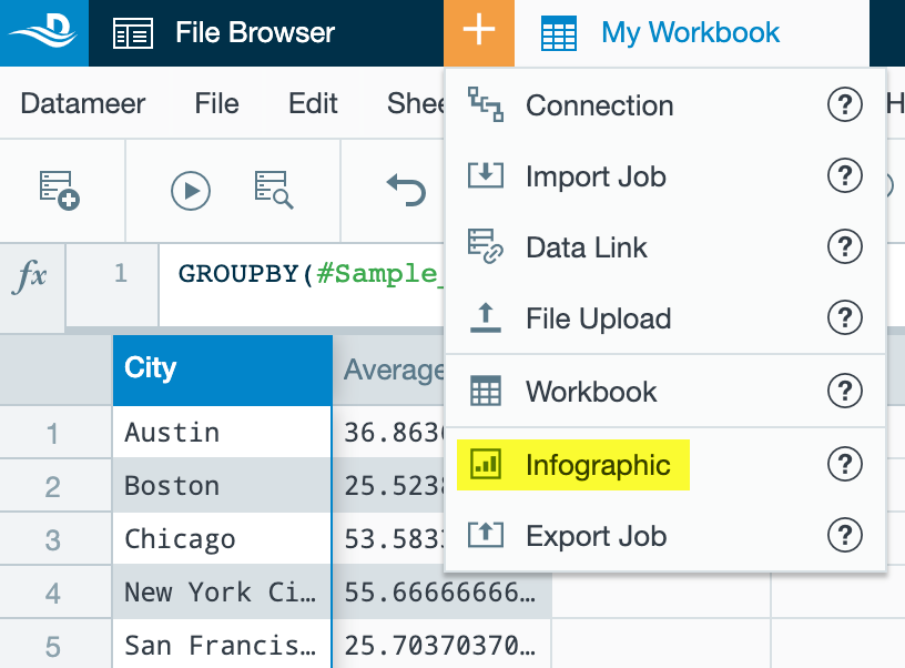
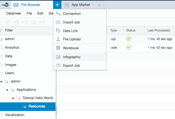
- In the File Browser, select your home folder.
- From the plus (+) menu in the top bar, select Infographic.
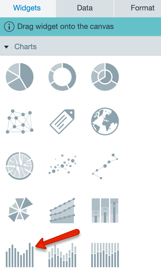
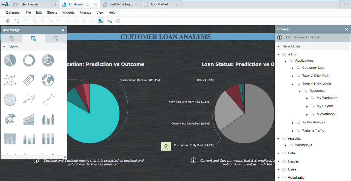
- Select a Multi-bar chart from the Add Widget toolbox and drag and drop it to the middle of the page. A multi-bar chart is a great choice because it shows the simple relationship between the data.
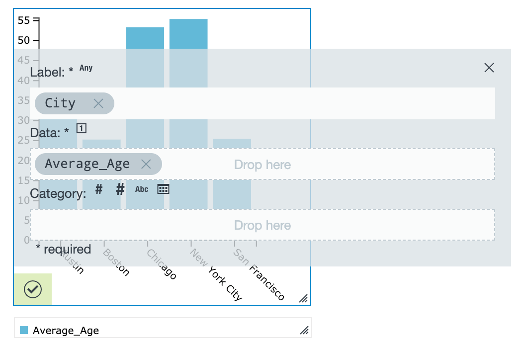
- Click the Data tab on the widget to show which properties need to be entered for the configuration.
- Navigate to Your home folder > My Workbook in the Browser toolbox on the right. From there, open Latest Results > Sheet1 by clicking the arrow next to the name. If your workbook is still running, wait for the results. If it hasn’t run yet, right-click the workbook in the File Browser and select Run.
- Drag the City column to the Label field and the Average_Age column to the Data field of the widget. The updated widget now shows you the relationship between age and location. Click off of the chart to close the Data tab and view the chart, which shows you that the average age in New York City is the oldest of the cities included. Hover over the columns to see the information.
- From the File menu, select Save.
- Name your infographic and click Save.
If you close your infographic and want to view it again, open the infographic in the File Browser by double- clicking the name of your infographic to view your chart.
Congratulations! You’ve now performed your first analysis. Enjoy exploring Datameer, and for more information and help along the way, check out our documentation.
Say "Hello" to Datameer (Pre-Datameer 7.4.x)
Follow this tutorial to complete the simplest end-to-end analytics example. You upload some data, build an analytics workbook, and visualize your results in an infographic.
This tutorial describes how to open this file after it's downloaded from the App market. To download the app, click the App Market tab from inside Datameer, locate the app, and click Install.
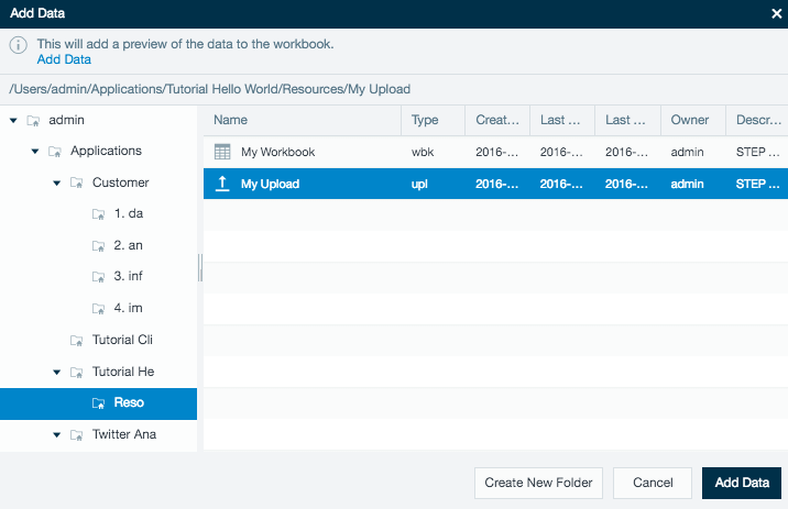
1. Open the first tutorial folder Tutorial Hello World in the File Browser tab or download the app from the App Market.
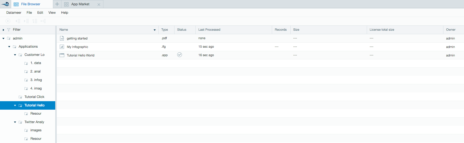
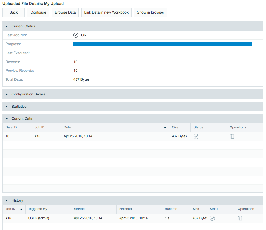
2. In the Resource folder, double-click the My Upload file and click Configure. (As of v6.3, click Open.)
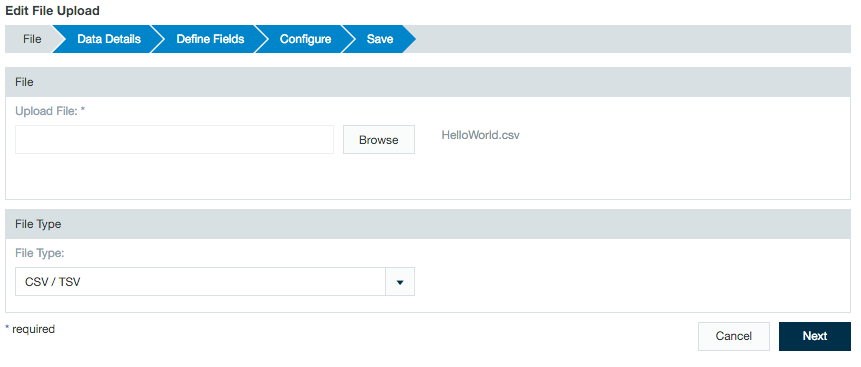
3. This screen is where you can choose the file you want to upload by clicking Choose File and format by selecting the drop-down menu. For this example, click Next to continue.
4. Under Data Details leave the Column names are contained in the first row containing data check box selected. Notice you can choose your delimiter and advanced options (e.g. quote character). Click Next to continue.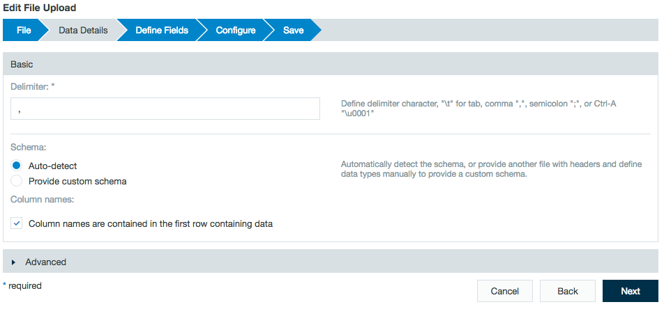
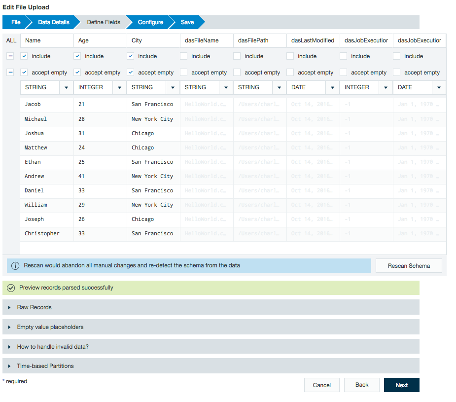
5. You now see a preview of the data where you can make any changes as needed to the file type, column name, or columns to include. Click Next.
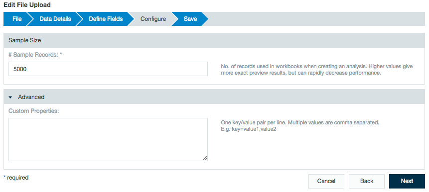
6. The configuration sections gives you the option of defining a sample size of the data to show. Under Advanced, users can define optional custom properties. Click Next.
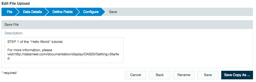
7. Save the file upload with the same name by clicking Save or create a copy by clicking Save Copy As...
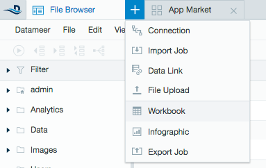
8. In the File Browser tab, click the + (plus) button and select Workbook. From the Add Data window, select MyUpload from the /Tutorial Hello World/Resources/ folder and click Add Data.
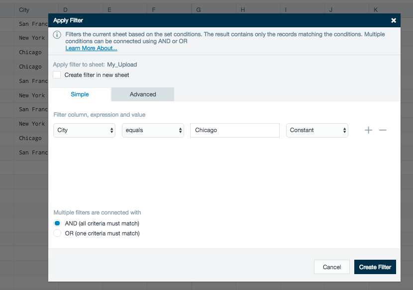
9. Once you have opened the data in your workbook you can now analyze the data. Click Filter on the tool bar and choose City as the filter column and Equals as the expression, and enter Chicago as your value. Click Create Filter.
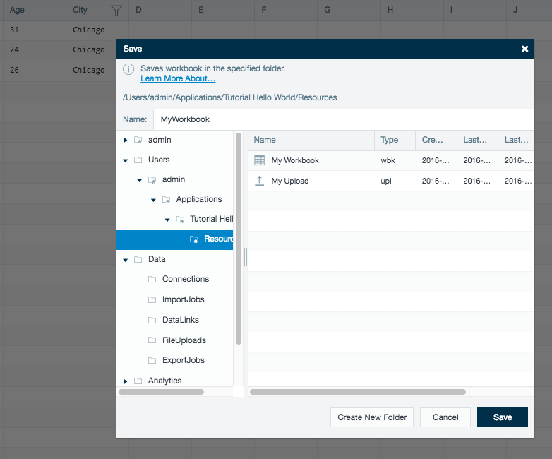
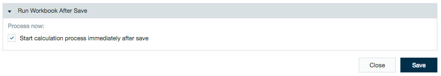
10. To save the workbook, click Save Workbook and choose a name for the file such as "MyWorkbook" and click Save. You have options on how and when to run the workbook. Select the Start calculation process immediately after save check box and then click Save to start the calculation.
11. After the workbook has been calculated you can visualize the analysis of your data using an infographic. Click the + (plus) button in the File Browser again and choose Infographic to create your first data visualization.
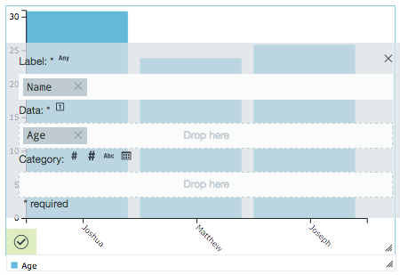
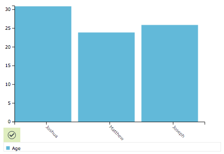
12. From the Add Widget inspector, drag-and-drop the bar chart onto the canvas. Click Data on the widget to add your data from your workbook. Navigate to MyWorkbook, under in the Browser on the right to latest results, and drag the Name column to the Label field, and the Age column to the Data field. The widget updates automatically. That’s it! If you want to save this infographic, click the Save icon, and you’re all set. Have fun exploring!
Once you've completed this example, you might want to explore the workspace (below), or continue on to the next example: Basic Tutorial.
Exploring the Workspace
When you first log in, you see that you are under the File Browser tab. In the File Browser, you can quickly move among data sets, workbooks where you create analytics, and infographics where you create reports and visualize your data. You can also open multiple tabs to navigate between the different worksheets with ease.
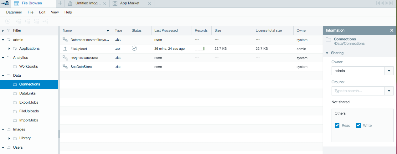
File Browser Navigation Bar
From the navigation bar on the left side of the screen you can easily move through the folders where files are saved in Datameer and see information relating to your files. From here you can set up connections, import jobs and export jobs, work with workbooks, set up data links, and create infographics.
To get started using Datameer, right-click on the page, choose Create new and make a selection. You can also use the + (plus) button to make a quick selection and open a new tab.
Import data
Create workbooks
Create and edit workbooks.
For workbook shortcuts, see Keyboard Shortcuts.
Visualizing data
Datameer's infographic tools help you create informative and exciting visual displays of your data.
Admin Tab
The Admin tab (which is only available if your account has administrator permissions) provides access for configuring job settings, underlying data settings, permissions, and user settings. The Datameer administrator sets the permissions for your account specifying the read and write access for the available data sources, workbooks, and infographics.
What Next?
If you've completed the Hello World example, we recommend the basic tutorial next, followed by the market research examples.