Enron Email Analytics
The Enron Email Analytics app demonstrates how you can use imports to do email analytics. This particular app uses the public Enron email archive.
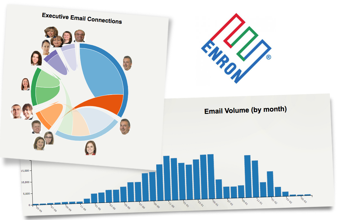
Infographic
This application uses two graphs to demonstrate how you can use infographics to visualize findings from your own email data, though this infographic uses publicly available Enron email information. The Executive Email Connections circular network widget shows which users are sending or receiving email from each other. The Email Volume (by month) graph tracks the frequency and volume of emails received and sent from Enron.
File Uploads
The EnronEmailFileUpload brings in the publicly available Enron email archive.
Workbook
All calculations are performed in the EnronEmailWorkbook. The Executive Email Connections widget uses data from the FromTo sheet, which is grouped together by sender and receiver and then counted. The Email Volume (by month) widget uses data from the EmailCountByMonthSort sheet, which sorts the counts of email grouped together by month.