Customer Loan
This app shows average loan amount borrowers take over time as well as how much interest rate is charged to borrowers. It also shows risk in three ways: distributed across the US states, by debt payments, and by loan types. Finally, the app predicts the outcome of loan application and statuses to evaluate loan performance.
Infographic
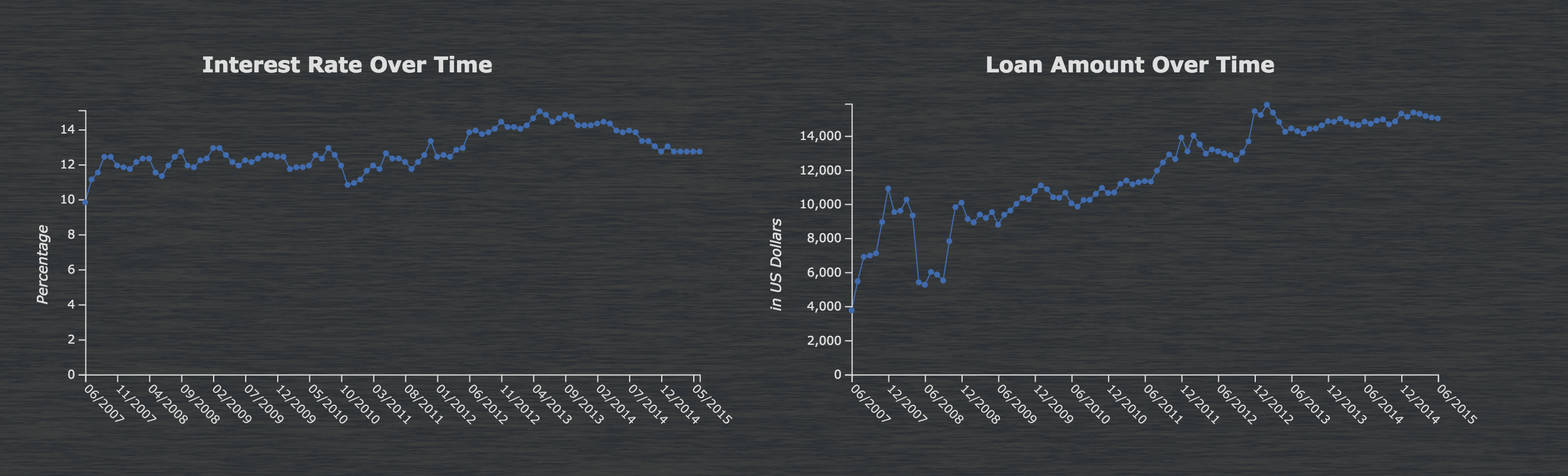
The eight different charts and graphs help illustrate trends in customers loans and interests using data about loans from June 2007 to June 2015 collected by the Lending Club. Use these graphs and charts to track and understand trends in the loan market, and compare your loan performance to the predicted loan performance. The infographic is distributed across three sections:
- The blue Interest Rate Over Time, Loan Amount Over Time, and Declined and Accepted Loans Over Time graphs show how interest rates and loan amounts have varied in the past eight years to show trends in the market.
- The orange Risk by Payment Debts, Risk by Loan Types, and Risk and Number of Loans by Location graphs and charts show how risk was distributed from 2007-2015 geographically, by type, and by the debt payments.
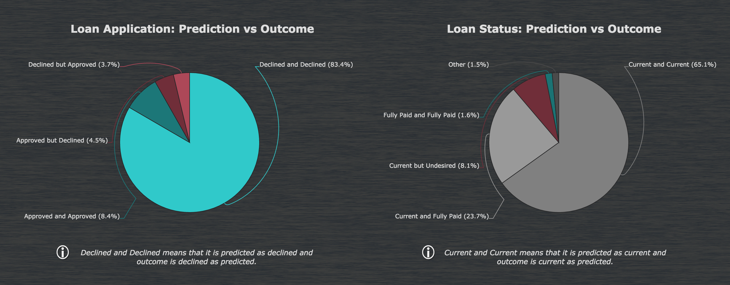
- The Loan Application: Prediction vs Outcome and Loan Status: Prediction vs Outcome pie charts show how the predictions of the loan outcome compared to the actual statistics for each status. Use this chart to understand to how well you perform against the predicted outcome. These charts are derived using decision trees. You can utilize Datameer's Flip Side on these decision tree sheets in the workbook to see a combination of attributes that result in a desirable or undesirable outcome and to improve your loan performance when applying to new loan data.
Connection and Import
This app uses the DeclinedLoans and LoanData imports for the loan data and the US States and Zip Codes file uploads to create the map of the United States.
Workbook
The TimeSeries workbook combines data from various time periods using a join to create the charts showing data over time. To create the risk charts and graphs, the data comes from the Risk workbook, which then joins the information from the imports with geographical data in the ByZipEnriched sheet to create the map of the United States. The LoanApplication DecisionTree workbook creates a union between the LoanData and DeclinedData sheets, then joins that data with the US_States sheet to create the Decision Tree sheet used in the Loan Application pie chart. Similarly, the data for the Loan Status pie chart is from DecisionTreeLoanStatus sheet in the LoanStatus DecisionTree workbook.