Categorical Bubble and Line Plot
This widget replaces the Bubble and Line Plot widget.
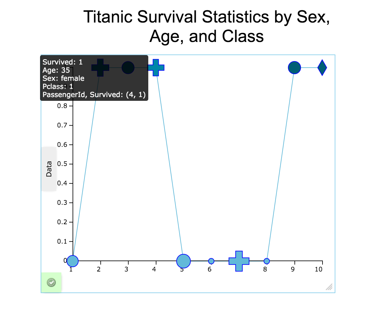
Creates a categorical bubble chart which is a variation of a line chart. The entities displayed on a categorical bubble chart are compared in terms of their size, their relative positions with respect to each numeric axis, their color, and their shape. Since both the x and y axes of the bubble chart are numeric scales, position is an indicator of two distinct numeric values. The area of the plot depends on the magnitude of a third numeric characteristic. The shape and color can help sort the entities into categories. Categorical bubble charts can be used in project management to compare risk and reward among projects. They can facilitate the understanding of social, economic, medical, and other scientific relationships. You can think of them as performing a visual square-root transformation on the data set.
Configuring the Bubble Chart/Line Plot
Here you can find out what kind of data can be represented as a categorical bubble chart and what options you have to represent your data. General steps for configuring widgets are explained on the Visualizing Data page.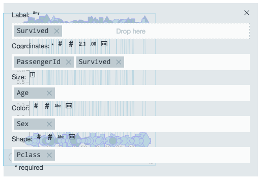
Data Requirements
You can use any type of Datameer supported data as the labels in a categorical bubble chart. The values used to plot the y-axis and the size factor of the bubble must be a number. The values used to determine the color and shape can be a date, integer, big integer, or string. The value used to calculate the size must be a number.
Appearance - Specific Settings
The appearance of a categorical bubble and line chart can be adjusted through standard and specific settings.
Standard widget settings give you basic controls in order to customize a widget. Learn more about standard widget settings here.
Specific widget settings give you more controls over details pertaining to the line chart widget. With these controls, you can adjust your widgets to create the perfect infographic to fit your needs.
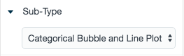
Sub-type
The sub-type allows for the widget to be switched between a line plot chart to a scatter chart.
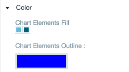
Color
Color settings lets you adjust the color aspects of the widget. The top color bar represents the colors currently being used for the widget. Use the color wheel by clicking in a color box and selecting the color to add to that space.
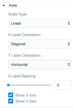
Axes
Adjust the scale for the data on the X and Y axes between logarithmic, square root, linear, square, and quadratic. The labels are able to be adjusted on both axes in a horizontal, vertical, or diagonal position.
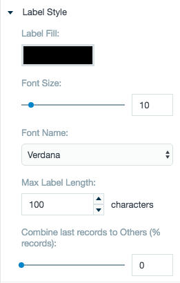
Label style
The label settings give you controls to adjust how labels are displayed on the widget. You can control the size and type of fonts as well how they are viewed.
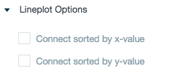
Lineplot options
The line plot options settings adjust how the lines on the widget are connected to the widget, either via the X or Y axis. The default option has the line plotted via the Y axis.
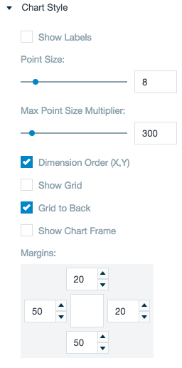
Style
Chart style settings give options to adjust widget positioning and styles. Data points on the widget can be given a range of shapes. Adjust the size of the points and how the data shows up on the widget.
Use the margin adjuster to perfectly position the widget within the frame.
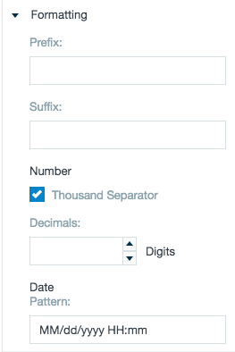
Formatting
Formatting settings gives you controls to added pre/suffix to labels, add in a thousands separator for data, and adjust how the date can be displayed.