American Time Use
Infographic
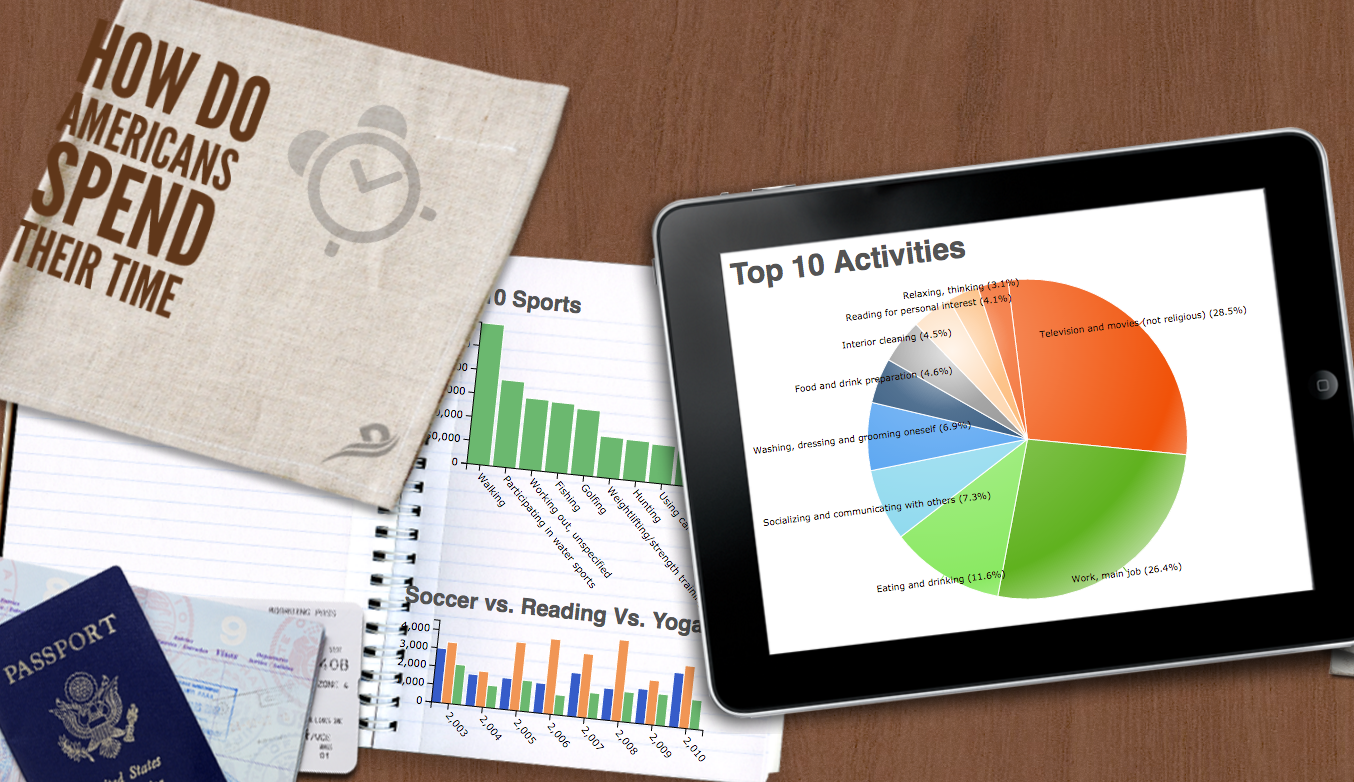
This app analyzes data from the American Time Use survey, which is collected by the Bureau of Labor Statistics. This survey measures the amount of time people spend doing various activities, such as paid work, childcare, volunteering, and socializing. The data is given as a table containing time intervals with activity codes. The app analyzes and then presents the following charts in the infographic:
- Plots the top ten sport activities in a bar chart.
- Plots the top ten overall activities in a pie chart.
- Compares the amount of time spent on soccer, reading, and yoga over the years.
Connection and Import
The actual time use data is downloaded as a CSV file from the web using the American Time Use"import job. The file uploads Activity codes and Location Codes are CSV files giving text descriptions for the various codes used in the time use data.
Workbook
The American Time Use workbook first joins the time use data with the activity codes and location codes sheets to obtain text descriptions for all time intervals (sheet Joined). It then groups the intervals by overall duration (AggregatedActivities) and sorts this data (TopActivities) to compute the data for the Top Ten Activities chart. The Top Ten Sports chart uses the same principle (sheets BySport and TopSports), but filters out any non-sport activities before doing so (SportsEnt). The SoccerReadingYogasheet filters all but the mentioned activities, which is then grouped by year in the sheet ActvitiesOverYears. This data is used in the Soccer vs Reading vs Yoga chart.
