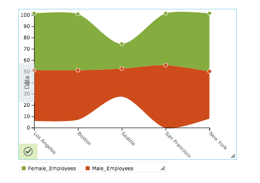
Stream Area Chart
Creates a stream area chart. For continuous data such as time series, a stream area chart can be used in place of regular stacked bars/area charts. Stream area charts are a generalization of stacked area graphs where the baseline is free. By shifting the baseline, it is possible to minimize the change in slope in individual series, thereby making it easier to perceive the thickness of any given layer across the data.
Configuring the Stream Area Chart
Here you can find out what kind of data can be represented as a stream area chart and what options you have to represent your data. General steps for configuring widgets are explained on the Visualizing Data page.
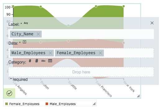
Data Requirements
You can use any type of Datameer X supported data as the label in a stream area chart. The values used to plot the data must be numbers.
Appearance - Specific Settings
The appearance of a stream area chart can be adjusted through standard and specific settings.
Standard widget settings give you basic controls in order to customize a widget. Learn more about standard widget settings here.
Specific widget settings give you more controls over details pertaining to the stream and area chart widget. With these controls, you are able to adjust your widgets to create the perfect infographic to fit your needs.
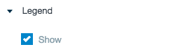
Legend
Legends can be shown or hidden. All legends move along with the parent widget, but they can be independently moved if separately selected.
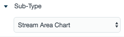
Sub-type
The sub-type allows for the widget to be switched between a stream area chart to a stacked bar chart, grouped bar chart, percent bar chart, multi bar chart, area chart, or line chart.
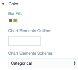
Color
Color settings let you adjust the color aspects of the widget. The top color bar represents the colors currently being used for the widget. Use the color wheel by clicking in a color box and selecting the color to add to that space.
The chart elements scheme let you decided between having multiple colors or a flat color for the graphic.
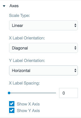
Axes
Adjust the scale type for the data between logarithmic, square root, linear, square, and quadratic. The labels are able to be adjusted on both axes in a horizontal, vertical, or diagonal position. X label spacing adjusts the width between each label.
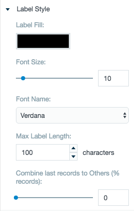
Label style
The label settings give you controls to adjust how labels are displayed on the widget. You can control the size and type of fonts as well how they are viewed.
The combine last records adjustment bar allows for an "other" line of the stream area chart to be created from lesser percentage parts of the data.
Line chart formatting
Include or take away data points on the line, shade the area inside the lined area, adjust the size of the data points, and specify how taught the lines on the widget are made.
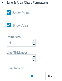
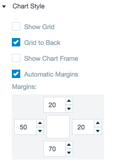
Chart style
Chart style settings give options to adjust widget positioning and styles. Use the margin adjuster to perfectly position the widget within the frame.
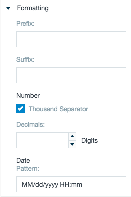
Formatting
Formatting settings give you controls to added pre/suffix to labels, add in a thousands separator for data, and adjust how the date can be displayed.
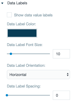
Data labels
Adjust the settings for the labels on the data. Choose a color and adjust the data font size, orientation, and spacing.