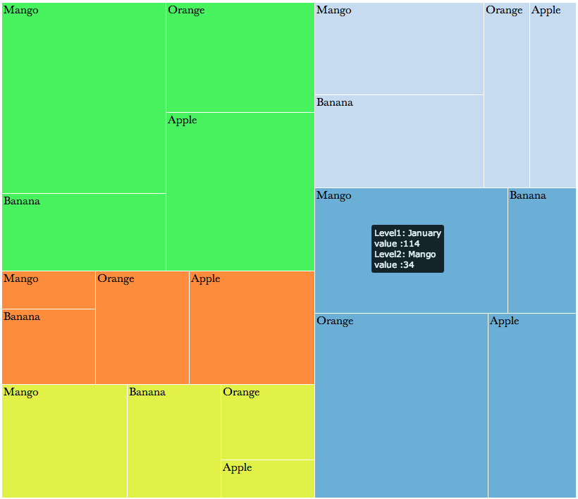
Treemap
The treemap widget is a space-filling hierarchical layout and works in much the same way as a Sunburst. It is effective for grouping attributes visually using size and color forming sets of nested triangles.
Configuring the Treemap
Here you can find out what kind of data can be represented as a Treemap chart and what options you have to represent your data. General steps for configuring widgets are explained on the Visualizing Data page.
Data Requirements
The Data level of the Treemap must be filled in with string data types. The Values level of the Treemap must be filled in with a single number value.
Appearance-Specific Settings
The appearance of a Tteemap can be adjusted through standard and specific settings.
Standard widget settings give you basic controls in order to customize a widget. Learn more about standard widget settings here.
Specific widget settings give you more controls over details pertaining to the tree map widget. With these controls, you can adjust your widgets to create the perfect infographic to fit your needs.
Legend
Legends can be shown or hidden. All legends move along with the parent widget, but they can be independently moved if separately selected.
Color
Color settings let you adjust the color aspects of the widget. The top color bar represents the colors currently being used for the widget. Use the color wheel by clicking in a color box and selecting the color to add to that space.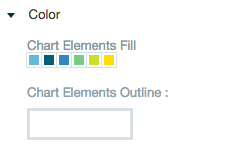
Label style
The label settings give you controls to adjust how labels are displayed on the widget. you can control the size and type of fonts as well how they are viewed.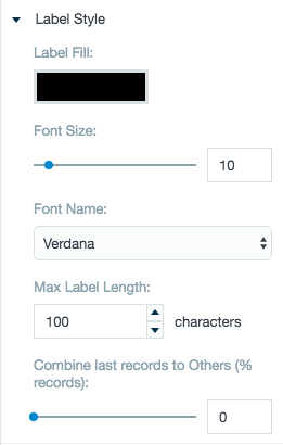
Chart variant and style
Chart style settings give options to adjust widget positioning. Use the margin adjuster to perfectly position the widget within the frame.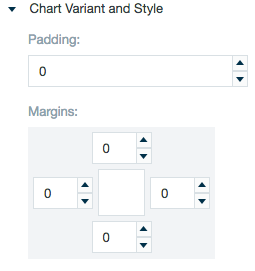
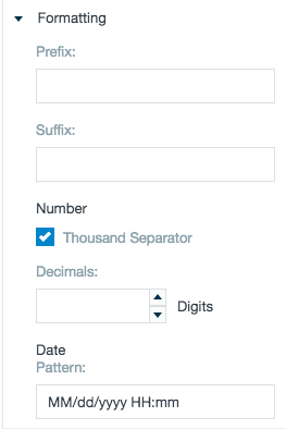
Formatting
Formatting settings give you controls to added pre/suffix to labels, add in a thousands separator and number of decimal places for data, and adjust how the date can be displayed.